Mastering Stock Chart Analysis
Anatomy of Charts
The Language of Charts
Technical analysis starts with one primary tool: the price chart. It's a visual record of an asset's price over time. While there are many ways to display this data, analysts typically rely on three main types: line charts, bar charts, and candlestick charts.
The primary tool of technical analysts is the price chart.
A line chart is the simplest form. It connects a series of closing prices over a set period. This creates a clean, easy-to-read line that shows the general price trend. However, its simplicity is also its biggest weakness. By only using the closing price, it filters out all the price action that happened during the trading period—the opening price, the highest point, and the lowest point.
To get a more detailed picture, analysts use charts that display four key data points for each period. This is known as OHLC data.
| Data Point | Description |
|---|---|
| Open (O) | The first price traded during the period. |
| High (H) | The highest price traded during the period. |
| Low (L) | The lowest price traded during the period. |
| Close (C) | The final price traded during the period. |
Bars and Candlesticks
Bar charts and candlestick charts both use OHLC data to paint a much richer picture of market activity.
A bar chart consists of a vertical line and two small horizontal ticks. The top of the vertical line is the high price, and the bottom is the low price. The tick on the left shows the opening price, and the tick on the right shows the closing price.
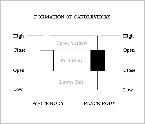
Candlestick charts, which originated in 18th-century Japan, display the same OHLC information but in a more visually intuitive way. This is why they are the preferred chart type for most technical analysts.
A single candlestick has two main parts: the body and the wicks.
The Body: This is the wide part of the candlestick. It represents the range between the opening and closing prices. Its color tells you the direction of the price movement. A green (or white) body means the price closed higher than it opened (a bullish candle). A red (or black) body means the price closed lower than it opened (a bearish candle).
The Wicks: Also called shadows or tails, these are the thin lines extending above and below the body. They show the highest and lowest prices reached during the period.
The power of candlesticks lies in this immediate visual feedback. A long green body shows strong buying pressure. A long red body with a long upper wick might suggest that buyers tried to push the price up, but sellers ultimately took control and pushed it back down. Each candle tells a story of the battle between buyers (bulls) and sellers (bears) within that timeframe.
At their core, candlestick patterns are a visual language of market psychology, where each formation tells a story of the struggle between fear and greed, with the shape, size, and position of the candles revealing the intensity and potential outcome of these battles.
Choosing a Timeframe
Each bar or candle on a chart represents a specific unit of time. This timeframe is chosen by the analyst and dramatically affects what the chart shows. A day trader might use a 1-minute or 5-minute chart, where each candle shows 1 or 5 minutes of trading activity. They are looking for very short-term patterns.
A swing trader might use a daily chart, where each candle represents a full day. This smooths out the small, intraday price swings and reveals larger trends that unfold over weeks or months. Long-term investors often look at weekly or even monthly charts to get the broadest possible view of an asset's price history.
There is no single "best" timeframe. The right choice depends entirely on your trading or investing strategy and goals.
Now that you understand how charts are constructed, you're ready to start interpreting the patterns they form.