Mastering Semantic HTML Structure
Document Structure Logic
The Blueprint of a Web Page
An HTML file isn't just a list of tags; it's a structured document with a logical hierarchy. When a browser loads your page, it doesn't just read the tags in order. It builds a map of how every element relates to every other element. This map is called the Document Object Model or DOM.
Think of the DOM as a family tree. Every element has a parent, and it can have children and siblings. This tree structure is the key to understanding how browsers, screen readers, and even JavaScript interact with your page.
This entire structure starts with a declaration and a single root element.
The Root and Its Branches
Every modern HTML page begins with <!DOCTYPE html>. This isn't a tag, but an instruction for the browser, telling it to render the page in standards mode. Immediately after, the <html> tag acts as the root of the document tree. Everything else is nested inside it.
Within the <html> tag, you should always include the lang attribute, like <html lang="en">. This tells assistive technologies, such as screen readers, what language the content is in, ensuring correct pronunciation and translation.
<!DOCTYPE html>
<html lang="en">
  <head>
    <!-- Metadata goes here -->
  </head>
  <body>
    <!-- Visible content goes here -->
  </body>
</html>
The <html> element has two direct children: <head> and <body>.
-
The
<head>: This section contains metadata—information about the page that isn't displayed directly. This includes the page title, links to stylesheets, and important instructions for the browser. -
The
<body>: This is where all the visible content lives. Headings, paragraphs, images, and links all go inside the body.
Essential Metadata
While the <head> section can contain many things, two <meta> tags are critical for every modern website.
First is the character set declaration: <meta charset="UTF-8">. This tells the browser which character encoding to use, ensuring that text and symbols display correctly across different languages and platforms. Using is the universal standard.
The second is the viewport meta tag: <meta name="viewport" content="width=device-width, initial-scale=1.0">. This tag is the cornerstone of responsive design. It instructs the browser to set the width of the page to the device's screen width and establish a 1:1 scale. Without it, mobile browsers would try to display the desktop version of a site, forcing users to pinch and zoom.
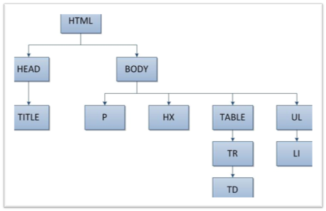
Understanding this nested, tree-like structure is what separates basic markup from professional web development. The browser uses this hierarchy to apply CSS styles, and JavaScript uses it to find and manipulate specific elements on the page. Every <div>, <p>, and <a> tag you write finds its place in this overarching structure.
Time to check your understanding of how these pieces fit together.
What does the acronym DOM stand for, and what does it represent in web development?
What is the primary purpose of the <!DOCTYPE html> declaration?
By thinking in terms of this document tree, you can build pages that are more logical, accessible, and easier to manage.