Mastering Professional Flyer Design
Visual Hierarchy
Layout is Message
You've written the perfect copy. It's sharp, persuasive, and gets straight to the point. But on a flyer, the words themselves are only half the battle. How you arrange those words and images—the layout—is what turns a piece of paper into a message that gets noticed.
Visual hierarchy is the art of arranging elements to guide a reader’s eye through your content in a specific order. It’s the silent partner to your copywriting, ensuring the most important information gets seen first, followed by supporting details, and finally, the call to action. Without a clear hierarchy, your carefully crafted message can become an unreadable jumble.
Guiding the Reader's Eye
People don't read flyers; they scan them. Your design must account for this by following predictable eye-tracking patterns. The two most common for printed media are the Z-Pattern and the F-Pattern. The choice depends on the density of your information.
The Z-Pattern is ideal for simple flyers with minimal text. The eye naturally moves from top-left (your headline) to top-right (perhaps a compelling image), then scans diagonally down to the bottom-left (supporting details), and finally settles on the bottom-right (the call to action).
The F-Pattern applies to more text-heavy designs. Readers scan the top of the page, then drop down and scan another horizontal line, and finally trail down the left side of the content. This means your most critical information must be at the top, and subsequent points should be easy to grab from the left margin with strong keywords or bullet points.
Hierarchy in Practice
Knowing the patterns is one thing; building them is another. You create hierarchy using size, color, spacing, and typography. The goal is to make the flyer easily scannable, even from a distance. This is often called the 10-foot rule: can someone walking by understand the main point of your flyer from 10 feet away? Your headline should be large enough to pass this test.
By employing visual hierarchy techniques, such as strategic use of size, color, and placement, we emphasize key elements and create a clear path for viewers to follow.
One of the most powerful tools for creating clarity is not what you add, but what you leave out. This is the strategic use of —the empty areas around your text and images. Clutter is the enemy of a good flyer. White space gives your content breathing room, reduces cognitive load, and helps the important elements stand out. It creates focus and a sense of professionalism.
Combine this with the for a balanced composition. Imagine your flyer divided into a 3x3 grid. Placing key elements—like your main headline or the subject of an image—along these lines or at their intersections creates a more dynamic and visually appealing layout than simply centering everything.
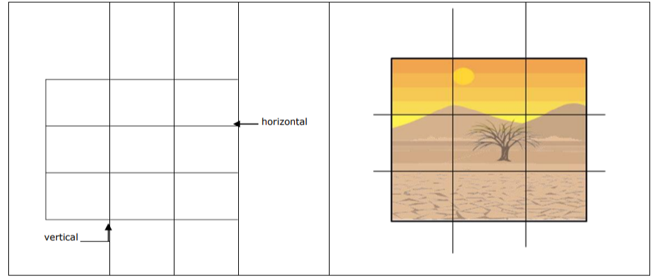
Finally, use typographic scaling to reinforce importance. Your headline should be the largest text element. Subheadings should be smaller, and body copy smaller still. This creates an immediate, intuitive sense of what to read first, second, and third. A common mistake is making all text a similar size, which forces the reader to work too hard.
| Element | Size Priority | Purpose |
|---|---|---|
| Headline | 1 (Largest) | Grab attention, state the main idea |
| Subheading | 2 (Medium) | Provide context, break up text |
| Body Copy | 3 (Standard) | Give details, explain the offer |
| Call to Action | 1 or 2 | Guide the next step, must be visible |
| Contact Info | 3 or 4 (Smallest) | Provide necessary but secondary info |
By combining these principles, your layout does more than just hold text. It actively works with your copy to guide, persuade, and drive action.