Mastering Practical Graphic Design Systems
Advanced Visual Hierarchy
Directing the Eye
You already know that visual hierarchy tells viewers what to look at first. But in a complex design, you're not just creating a single focal point; you're creating a path for the eye to follow. Understanding how people naturally scan information is the first step to guiding them effectively.
On the web, users rarely read every word. Instead, they scan. Two dominant patterns have emerged from eye-tracking studies: the F-Pattern and the Z-Pattern. The is common on text-heavy pages like articles or search results. Users scan horizontally across the top, then down the left side, occasionally jutting out to read a subheading or a few words that catch their eye. The Z-Pattern appears on less dense, more graphically-driven pages. The eye moves from top-left to top-right, slants down to the bottom-left, and then scans across to the bottom-right.
By understanding these tendencies, you can place key information where users are already looking. A call-to-action button at the end of a Z-path feels natural. A critical piece of data along the stem of an F-path gets noticed. You're not fighting user behavior; you're working with it.
Space as a Tool
In a complex layout, the empty areas are just as important as the filled ones. White space, or negative space, is an active tool for managing cognitive load and creating sophisticated visual relationships. Instead of cramming information together, strategic use of space separates distinct sections, groups related items, and draws attention to key elements without adding clutter.
Think of it as punctuation for your design. Just as a paragraph break signals a new idea, a larger margin of white space can signal a new section on a webpage. This reduces the mental effort required from the user to parse the information, making the entire experience feel clearer and more intuitive.
Using white space and visual hierarchy creates order and focus.
This becomes critical in data-heavy environments like dashboards or financial reports. By using space to group related charts or figures, you create logical units that are easier to digest. You don't need lines or boxes to divide content when space can do the job more elegantly.
Rhythm and Scale
For documents or websites with a lot of text, a well-defined typographic scale is essential. This isn't just about making headlines bigger than body text. It's about creating a consistent, mathematical relationship between different text sizes, such as a modular scale based on a ratio like 1.618 (the golden ratio).
A consistent scale creates rhythm and predictability. The user's brain learns to recognize the function of each text style—this is a main heading, this is a subheading, this is a blockquote. This consistency, combined with regular spacing and leading, makes dense information feel orderly and accessible, not overwhelming. The underlying structure is guided by , which describe how humans naturally perceive objects as organized patterns.
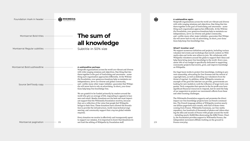
For example, in a complex UI component like a settings panel, you can use the principle of Proximity to group related toggles and inputs. By placing them close together and separating them from other groups with white space, you create clear, intuitive sections without needing to add extra visual dividers. The human brain does the work for you.
Balancing Act
In the real world, stakeholders often want multiple things to be the primary focus. You might be asked to design a homepage where a 'Sign Up' button, a 'Learn More' link, and a 'View Demo' video are all equally important.
This is where advanced hierarchy shines. You can't make everything the biggest and brightest element. Instead, you create a tiered system. The most critical action gets the highest visual weight—perhaps a solid-colored button. The secondary action can be an outlined 'ghost' button, and the tertiary action might be a simple text link. They are all clearly present and accessible, but their visual treatment communicates their relative importance, guiding the user without creating chaos.
By moving beyond simple focal points to create a thoughtful narrative flow, you can handle complex requirements and guide users gracefully through even the most information-dense interfaces.
On a text-heavy page like a blog article or search results, which scanning pattern are users most likely to follow?
In a complex, data-heavy dashboard, what is the primary function of white space (negative space)?