Mastering Power BI for Research Permit Tracking
Introduction to Power BI
What is Power BI?
At its heart, Power BI is a tool that helps you tell a story with data. It takes raw numbers from spreadsheets, databases, or cloud services and transforms them into clear, interactive visuals. Instead of staring at endless rows and columns, you can see trends, patterns, and insights at a glance.
Power BI is a data visualization and business intelligence tool that allows users to connect to various data sources, clean and transform data, and build visual dashboards that tell compelling data stories.
Think of it like a kitchen for your data. The main components work together to turn raw ingredients into a finished meal.
- Power BI Desktop: This is your main workshop. It’s a free application you install on your computer where you connect to data, build your charts, and arrange them into reports.
- Power BI Service: This is the online, cloud-based platform. Once you’ve built a report in Desktop, you publish it to the Service to share it with others. This is where you can create dashboards and manage access.
- Power BI Mobile: This lets you view and interact with your reports and dashboards on your phone or tablet, so you can check on your data from anywhere.
Connecting to Your Data
The first step in any project is getting your data into Power BI Desktop. The tool is designed to connect to a huge variety of sources. You might have your data in a simple Excel file, a complex SQL database, or a cloud service like Google Analytics. Power BI can handle them all.
To connect, you’ll use the “Get Data” button on the Home ribbon. This opens a window with a long list of options. For many common sources, like Excel, it’s as simple as selecting the option, navigating to your file, and choosing which tables or sheets you want to import.
Power BI doesn't change your original data file. It creates a connection and pulls a copy into your report, so your source data remains safe and untouched.
Once connected, your data's columns (or fields) will appear in the Fields pane on the right side of the screen. This list is your palette of ingredients for building visuals.
Building Your First Visual
With your data loaded, you can start creating visuals. This process is intuitive and uses a drag-and-drop interface.
First, select a chart type from the Visualizations pane. This pane is full of icons for bar charts, line charts, pie charts, maps, and more. Let's say you pick a clustered column chart. An empty placeholder for that chart will appear on your report canvas.
Next, look at your Fields pane. To build the chart, you simply drag the data fields you want to use into the chart’s configuration wells, which are located just below the visual icons. For a column chart, you might drag a 'Project Group' field to the X-axis well and a 'Permit Count' field to the Y-axis well.
Instantly, the chart on your canvas comes to life, showing the permit count for each project group. You can resize it, move it around, and change its colors and labels to make it just right.
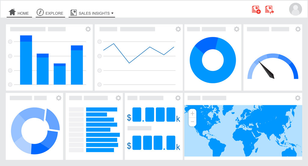
The real power comes from combining multiple visuals into a single report page. You could add a pie chart showing the status of permits and a map showing their locations. When you do, the charts become interactive. Clicking on a slice of the pie chart—say, the 'Approved' permits—will automatically filter the column chart and map to show data for only those approved permits. This interactivity is what makes Power BI dashboards so effective for exploring data and discovering insights.
Now let's test what you've learned about the fundamentals of Power BI.
What is the primary function of Power BI?
Where would you typically build a new report from scratch before sharing it?
This is just the beginning. By mastering these basics, you've built the foundation for creating powerful, data-driven reports that can provide valuable insights.