Mastering Monochrome Fashion
Color Temperature and Tones
Beyond the Color Wheel
You already know the basics of matching colors across the wheel. But creating a truly sophisticated look often means diving deep into a single color. The secret isn't just picking one hue, but understanding its temperature.
Think of red. An orangey, tomato red feels warm and vibrant. A deep, wine-colored burgundy feels cool and rich. They are both 'red,' but they have different personalities because they have different undertones. The same is true for nearly every color. A 'warm' pink like coral has hints of yellow, while a 'cool' pink like fuchsia leans toward blue.
The key to mastering color is seeing the hidden colors within.
This subtle, underlying color is called an and it's what determines if a color feels warm, cool, or neutral. Warm colors are based in yellow, orange, and red. Cool colors are based in blue, green, and purple. Getting this right is the foundation of creating a seamless, harmonious look, especially a monochromatic one.
Building a Monochromatic Look
A monochromatic outfit—one built from a single color—is a classic for a reason. It's chic, elongating, and effortlessly stylish. But the goal is to create harmony, not a flat, uniform block of color. The technique is to use different variations within the same color family to create depth and interest.
| Term | How It's Made | The Result |
|---|---|---|
| Tint | Hue + White | A lighter, pastel version |
| Tone | Hue + Gray | A more muted, subtle version |
| Shade | Hue + Black | A darker, deeper version |
Imagine building an outfit around navy blue. You could pair dark navy trousers (a shade) with a lighter, sky-blue blouse (a tint) and a dusty, slate-blue blazer (a tone). All three pieces are 'blue,' but their variations create a dynamic, textured look. The key is to keep the undertone consistent. If your navy is a cool, crisp blue, your lighter blues should also have that cool base.
Decoding Complex Colors
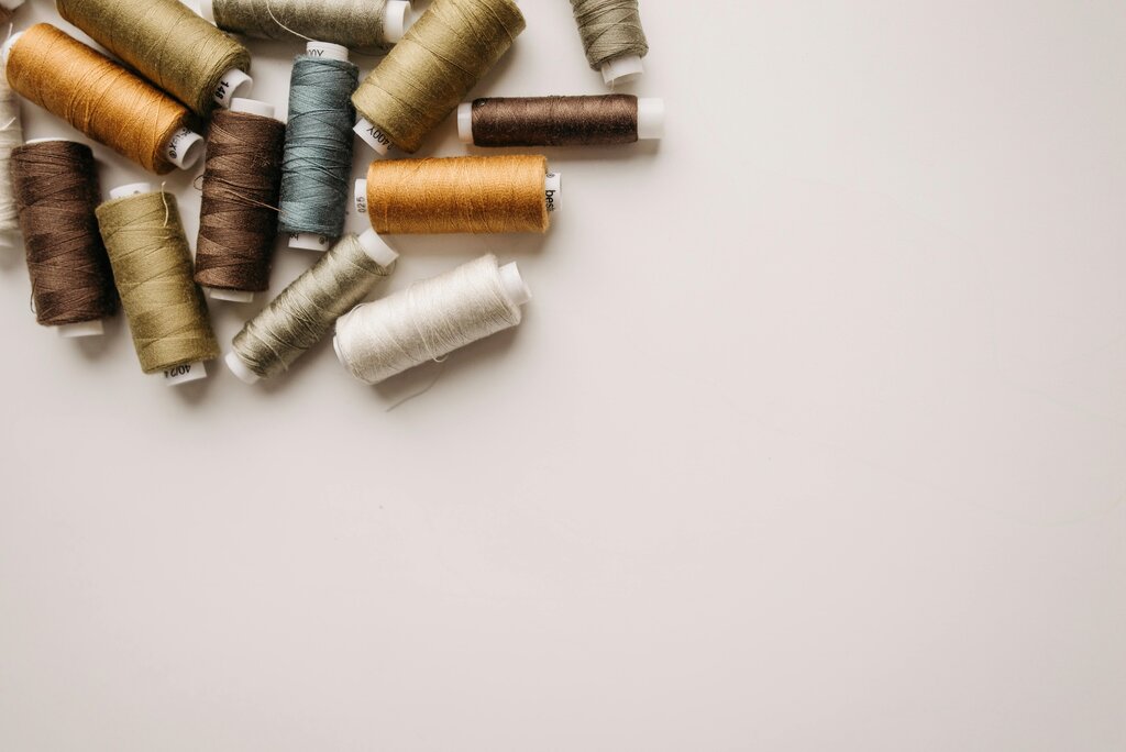
Identifying the undertone in a bright red is easy. But what about more complex, muted colors like olive, taupe, or beige? These neutrals are tricky because they're mixtures of several colors.
To find the temperature, place the color next to a true primary. Put an olive green sweater next to a bright, grassy green. Does the olive look more brownish or yellowish (warm)? Or does it look more grayish and blue (cool)? For taupe, compare it to pure gray. If it looks pinkish or yellowish, it's warm. If it looks more purple or blue, it's cool.
Lighting is your final variable. Natural daylight is the most neutral and will show you the truest version of a color. Incandescent bulbs cast a warm, yellow light that can make cool tones look muddy. Fluorescent lights often have a cool, blueish cast that can wash out warm colors. Always try to check your color pairings in the type of light you'll be wearing them in.
Creating Visual Flow
Using monochromatic tones correctly does more than just look chic—it can create , making you appear taller and leaner. Arranging tones in a gradient is a powerful way to achieve this. A dark shade at your feet that gradually gets lighter as it moves up your body draws the eye upward in a continuous, unbroken line.
For example, try charcoal gray shoes, medium gray trousers, and a light heather gray sweater. The eye follows this subtle shift in color seamlessly. The opposite works too: wearing a lighter shade on the bottom and a darker shade on top can ground your look.
Ultimately, this is the 'none' approach to color harmony: the colors are so well-integrated that the eye doesn't fixate on any single piece. Instead, it follows a smooth, uninterrupted flow.
What is the term for the subtle, underlying color that determines if a main color feels warm or cool?
What is the most important principle for creating a harmonious and sophisticated monochromatic outfit?
Mastering color temperature and tone is a subtle art. It moves you from simply matching colors to truly composing with them, creating looks that are intentional, harmonious, and sophisticated.