Mastering Looker Studio for Data Visualization
Introduction to Looker Studio
What Is Looker Studio?
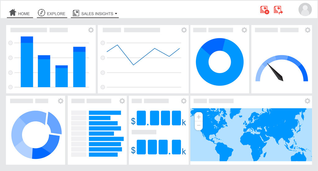
Looker Studio is a free tool from Google that transforms raw data into easy-to-understand reports and dashboards. Think of it as a translator for your data. It takes spreadsheets full of numbers and turns them into colorful charts, graphs, and maps that tell a story.
Its main job is to help you visualize information. Instead of staring at rows and columns, you can see trends, track performance, and share insights with others in a clear, visual way. Because it's a web-based tool, your reports are accessible from anywhere, and you can easily share them with your team for collaboration.
Key Features
Looker Studio stands out for a few key reasons. First, it connects to a huge variety of data sources. You can pull in data directly from Google products like Google Sheets, Google Analytics, and Google Ads, but it also works with databases, social media platforms, and more.
Second, it’s designed for collaboration. You can share your dashboards with colleagues just like a Google Doc. Team members can view or even edit reports together in real-time, making it simple to work on data analysis as a group. Finally, the reports are dynamic. Once you set up a connection to your data, the charts and graphs will update automatically as new data comes in. This means your reports are always showing the latest information without any manual work.
Looker Studio is seamlessly integrated with Google BigQuery, offering unparalleled performance for large datasets.
Connecting Your Data
The power of Looker Studio comes from its connectors. These are the bridges that link your data sources to your reports. Google provides free connectors for all its own services, making it incredibly easy to visualize data you already have in the Google ecosystem.
| Connector Type | Examples |
|---|---|
| Google Connectors | Google Sheets, Google Analytics, BigQuery, Google Ads, YouTube Analytics |
| Partner Connectors | Social media (Facebook, Twitter, etc.), databases (MySQL, PostgreSQL), marketing platforms |
| Other Sources | File upload (CSV), direct database connections |
There are hundreds of connectors available. This flexibility means you can pull information from almost anywhere to create a single, unified view of your performance.
Navigating the Interface
When you first open Looker Studio, the layout is straightforward. You'll land on a home page where you can see recent reports, create new ones, and access your data sources. Creating a new report opens the report editor, which is where you'll spend most of your time.
The main components of the report editor are:
- Canvas: This is the large, blank area where you build your report by adding charts, text, and images.
- Toolbar: Located at the top, it contains buttons to add new charts, controls (like date filters), text boxes, and other elements to your canvas.
- Panels: On the right side, you'll find the Properties Panel and the Data Panel. When you select a chart on your canvas, the Properties Panel lets you change its appearance (style) and the data it displays. The Data Panel shows all the fields available from your connected data source, which you can drag onto your charts.
Ready to check your understanding?
What is the primary purpose of Looker Studio?
In the Looker Studio report editor, which component is the main area where you add and arrange charts and text?
Now you have a solid foundation of what Looker Studio is and how it works. In the next steps, you'll learn how to connect your first data source and build a basic report.