Mastering Graphical Representations
Scaling and Precision
Choosing the Right Scale
You already know how to plot points on a Cartesian plane. But what happens when your data points are 10, 100, and 10,000? Squeezing them onto a simple 1-to-10 scale won't work. The scale of your axes doesn't just determine what fits on the page; it shapes the story your data tells.
The most common scale is linear. On a linear scale, the distance between 1 and 2 is the same as the distance between 99 and 100. Each tick mark represents an equal, additive step. This is great for data within a relatively small range, like tracking daily temperature fluctuations.
The key to good scaling is ensuring your intervals—the steps between tick marks—are consistent and appropriate for your data's range. If your data spans from 50 to 500, intervals of 100 might be perfect. If it spans from 0.1 to 1.0, intervals of 0.1 would be better.
But linear scales fail when dealing with data that grows exponentially or covers several orders of magnitude. Imagine plotting the number of transistors on a microchip over time. You'd have a few thousand in the 1970s and many billions today. A linear scale would show the early years as a flat line near zero, completely obscuring the initial growth. The later data points would shoot up so steeply they'd run off the page.
This is where logarithmic scales come in.
Thinking Logarithmically
Instead of equal additive steps, a logarithmic scale uses multiplicative steps. The distance between 1 and 10 is the same as the distance between 10 and 100, and between 100 and 1000. Each major tick mark represents a power of 10. This type of scale is perfect for visualizing data with a huge range.
It compresses the larger values and expands the smaller ones, letting you see trends across different orders of magnitude. A classic real-world example is the Richter scale, used to measure earthquake intensity. An earthquake of magnitude 6 is ten times more powerful than a magnitude 5, and one hundred times more powerful than a magnitude 4. A linear scale would make smaller, yet still significant, quakes almost invisible.
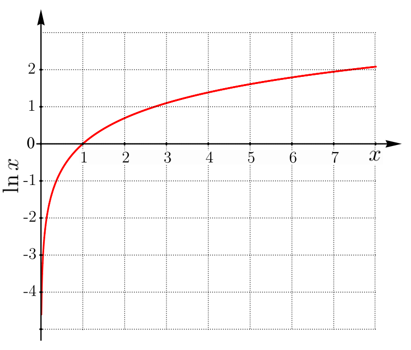
When both the x and y-axes use a logarithmic scale, it's called a log-log plot. This is useful for finding power-law relationships between variables, which appear as straight lines on a log-log plot. The formula for such a relationship is . Taking the logarithm of both sides gives us:
Semi-Log and Normalisation
What if your data shows exponential growth, like a bacterial colony or compound interest? Here, one variable grows at a steady rate, while the other explodes. For this, a semi-log plot is ideal. Typically, the y-axis is logarithmic, while the x-axis remains linear.
An exponential function like becomes a straight line on a semi-log plot. This transformation makes it incredibly easy to spot exponential trends and even calculate the growth rate from the slope of the line. Population growth models are often displayed this way to make future projections more intuitive.
Finally, be aware of visual bias. The choice of scale can dramatically alter the perception of data. A steep slope on one graph can look like a gentle incline on another simply by stretching or compressing an axis. This is why data range normalisation is a common technique in data science. It scales all numeric data to a specific range, often 0 to 1, to prevent variables with larger ranges from dominating an analysis.
Always question the scales you see on a graph. Are they linear or logarithmic? Does the axis start at zero? Thoughtful scaling reveals truth, while careless or manipulative scaling can easily mislead.
For each figure, work to understand each x- and y-axes, color scheme, statistical approach (if one was used), and why the particular plotting approach was used.
Let's review the key terms we've covered.
Now, let's test your understanding of these scaling principles.
What is the primary characteristic of a linear scale?
You need to create a graph showing the number of transistors on a computer chip from 1970 to the present day. The numbers range from a few thousand to many billions. Which type of plot is most suitable for this task?
Understanding how to properly scale your axes is a critical skill. It allows you to represent data faithfully and uncover the underlying patterns, whether they are linear, exponential, or something else entirely.