Mastering Graphical Representation and Data Visualisation
Mapping Data Types
Matching Data to its Form
Before you can visualise data, you must understand its nature. Not all data is created equal, and forcing it into the wrong type of chart is like trying to tell a story in a language your audience doesn't speak. It's not just ineffective; it can be misleading. The first step is always to classify your variables.
Data variables generally fall into four categories, which we can group into two pairs: categorical (nominal and ordinal) and numerical (discrete and continuous).
| Category | Type | Description | Example |
|---|---|---|---|
| Categorical | Nominal | Labels without any order. | Types of fruit (Apple, Banana, Orange) |
| Ordinal | Labels with a meaningful order, but the distance between them is not uniform. | T-shirt sizes (Small, Medium, Large) | |
| Numerical | Discrete | Can only take specific, separate numerical values. Often integers. | Number of cars in a car park |
| Continuous | Can take any value within a given range. | A person's height or the temperature of a room |
Categorising your data is the foundational step. If you know you have ordinal data, for example, you immediately know that the order of the items on your chart's axis matters. If you have nominal data, you could shuffle the order without losing any meaning.
Categorical Choices
For categorical data, your goal is to show comparisons between distinct groups. Bar charts excel at this. The length of each bar represents a value, such as count or frequency, making it easy to compare categories at a glance. For nominal data like 'Favourite Pet', the order of the bars (Dog, Cat, Fish) is arbitrary. You could reorder them alphabetically or by size and the chart's message would remain intact.
Ordinal data, however, has a built-in sequence. When visualising customer satisfaction ratings (Very Dissatisfied, Dissatisfied, Neutral, Satisfied, Very Satisfied), you must preserve that order. Placing 'Satisfied' next to 'Very Dissatisfied' would create a confusing and illogical picture. The progression along the axis adds a layer of meaning that isn't present with nominal data.
The rule is simple: if the data has a sequence, your visualisation must respect it. If it doesn't, you have more creative freedom in how you arrange the elements.
Numerical Nuances
When we move to numerical data, the visual tools change. While you could use a bar chart for discrete data (e.g., number of children per household), a line graph is a poor choice unless there's a time component. Connecting discrete points with a line implies a continuity that doesn't exist. You can't have 2.5 children.
Continuous data is where line graphs truly shine. They are perfect for showing trends over time or a continuous range because the line itself signifies the connection between data points. A graph of temperature over a 24-hour period makes sense as a line because the temperature exists at every single moment between the recorded points. The line is a truthful representation of the data's nature.
Remember to choose the right type of chart for your data; for instance, use line graphs for trends over time and bar charts for categorical comparisons.
Using a line graph for categorical data is a common mistake. If you plot sales figures for 'Apples', 'Bananas', and 'Oranges' and connect them with a line, you're visually implying a relationship or trend between them that simply isn't there. What does the line between 'Apples' and 'Bananas' even mean? This choice increases the viewer's cognitive load because they must work to override the visual suggestion of a connection. A bar chart, with its distinct and separate bars, avoids this confusion entirely.
The Principle of Visual Encoding
At the heart of choosing the right chart is the concept of [{
A bar chart, for instance, encodes a single numerical value as length. A scatter plot encodes two numerical values using position on the x and y axes. A heat map uses colour intensity to represent a value.
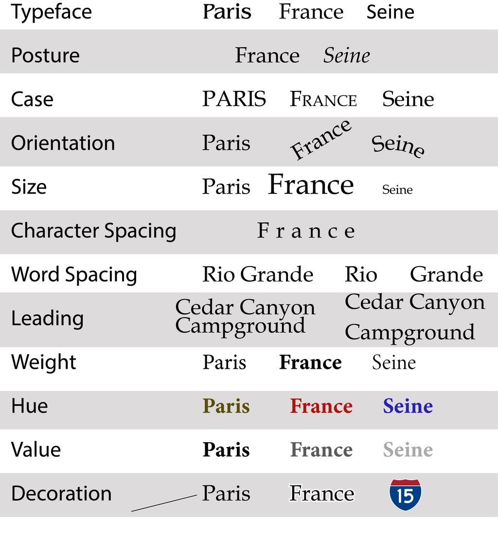
The goal is to select an encoding that our brains can decode accurately and efficiently. Research has shown that humans are very good at judging length and position along a common scale, which is why bar charts and line graphs are so effective. We are less precise at judging area (as in bubble charts) and angle (as in pie charts), which is why those chart types should be used with caution.
Choosing the right visualisation is not just about aesthetics. It is about selecting the visual encoding that most truthfully and clearly represents the underlying structure and relationships within your data. Get the mapping right, and the story in your data will tell itself.
Time to check your understanding of these core concepts.
Which of these datasets is an example of ordinal data?
A scientist records the exact temperature in a greenhouse every minute for 24 hours. Which chart type is most suitable for visualising this data to show the trend over time?
By correctly identifying your data type, you can choose a chart that communicates your findings clearly and honestly.