Mastering Google Looker Studio
Introduction to Looker Studio
What Is Looker Studio?
Google Looker Studio is a free tool that turns raw data into informative, easy-to-read reports and dashboards. Think of it as a bridge between a confusing spreadsheet and a clear, compelling story.
Its main job is data visualization. Instead of staring at rows and columns of numbers, you can create interactive charts, graphs, and tables that reveal trends and insights at a glance. This helps you and your team make smarter decisions based on what the data is actually saying.
Key Features
One of the biggest advantages of Looker Studio is that it's completely free. It's also fully web-based, so there's no software to install. You just need a Google account to get started.
The platform is built for collaboration. Much like Google Docs or Sheets, you can share your reports with team members, grant them viewing or editing access, and work together on the same dashboard in real time. This makes it easy to build and share insights across an organization.
Its drag-and-drop interface is intuitive, allowing you to build professional-looking reports without needing to write any code.
Connecting Your Data
A dashboard is only as good as the data it's built on. Looker Studio shines here by offering a vast library of "connectors" that link directly to your data sources. This means your reports can update automatically as your data changes.
It seamlessly integrates with other Google products like Google Analytics, Google Sheets, Google Ads, and BigQuery. Beyond the Google ecosystem, it can also pull data from SQL databases, social media platforms, and various third-party applications.
This flexibility allows you to consolidate information from different places into a single, unified view.
Types of Visualizations
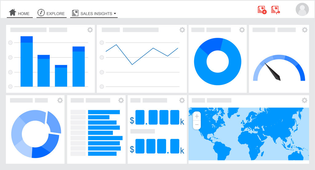
Looker Studio offers a wide array of visualization components to help you tell your data story effectively. You can mix and match these on a single dashboard to provide a comprehensive overview.
Some of the most common types include:
- Tables: For displaying detailed, row-by-row data.
- Scorecards: To highlight a single, key metric, like total revenue or number of users.
- Time Series Charts: Perfect for showing how a metric changes over time.
- Bar and Pie Charts: Classic choices for comparing categories or showing proportions.
- Geomaps: To visualize data by location, such as sales by country or website visitors by city.
Dashboards in Looker Studio aren't static. You can add interactive controls like date range filters and dropdown menus, allowing viewers to explore the data and find answers to their own questions.
Now, let's test your understanding of these core concepts.
What is the primary function of Google Looker Studio?
You want to display a single, crucial number on your dashboard, such as 'Total Website Visitors Today'. Which visualization component is best suited for this?
With these fundamentals, you're ready to start connecting data sources and building your first reports.