Mastering Forex Strategy and Risk Management
Technical Analysis Fundamentals
Reading the Market's Story
Each candlestick on a chart tells a short story of the battle between buyers and sellers within a specific timeframe. While you know the basics of what a candlestick represents, certain patterns can signal a powerful shift in market sentiment. These aren't just random shapes; they are footprints of supply and demand in action.
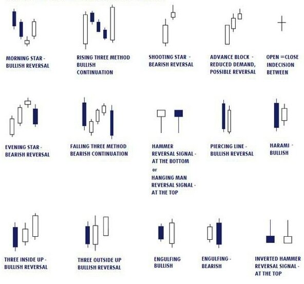
One of the strongest reversal signals is the engulfing pattern. It occurs when a candlestick's body completely swallows, or engulfs, the body of the previous candlestick. This pattern signals that the momentum has swung decisively in one direction.
| Pattern | What it Looks Like | What it Means |
|---|---|---|
| Bullish Engulfing | A small bearish (down) candle is followed by a large bullish (up) candle that completely engulfs the previous one. | Sellers were in control, but buyers stepped in with overwhelming force, suggesting a potential move higher. |
| Bearish Engulfing | A small bullish (up) candle is followed by a large bearish (down) candle that completely engulfs the previous one. | Buyers were in control, but sellers took over aggressively, suggesting a potential move lower. |
Other key reversal patterns are the Hammer and the Shooting Star. Both are defined by their long wicks (or shadows) and small bodies. The long wick shows that the price made a significant move in one direction during the period, but was forcefully rejected and closed back near its opening price.
A Hammer has a long lower wick, showing that sellers tried to push the price down but failed as buyers rushed in. It's a bullish signal. Conversely, a Shooting Star has a long upper wick, showing buyers tried to push the price up but were overwhelmed by sellers. It's a bearish signal.
The Power of Perspective
A single candlestick pattern is a clue, but it isn't the whole story. Its significance depends entirely on the context. The most important context comes from (MTA). This means looking at the same currency pair on different chart timeframes, like the daily, 4-hour, and 1-hour charts, to get a complete picture.
Think of it like using a map. The weekly chart is the satellite view showing the entire country and the direction of the main highway. The daily chart is the regional map, and the hourly chart is the street-level view for navigating a specific turn.
A strong bullish trend on the 1-hour chart might just be a minor pullback within a larger bearish trend on the daily chart. By aligning your trades with the direction of the higher timeframes, you increase the probability of success. Ignoring the bigger picture is a common mistake that leads to trading against the dominant market flow.
Beyond Simple Lines
You've likely heard of support and resistance as simple lines on a chart. A more effective way to view them is as zones. A support or resistance zone is an area where the price has previously reacted or pivoted. Instead of a single price point, it's a price range that represents a significant barrier.
These zones are important because they are often s. This is where large institutions and banks place their orders. When the price enters a resistance zone, for example, it hits a cluster of large sell orders, which can absorb the buying pressure and push the price back down. The opposite happens at a support zone with large buy orders.
Identifying these zones involves looking at historical data. Mark the areas on your chart where the price has stalled or reversed multiple times in the past. The more touches a zone has, the more significant it is considered to be.
Putting It All Together
The true skill of technical analysis is combining these elements. A candlestick pattern, a support/resistance zone, and multi-timeframe analysis are each useful on their own, but they become exponentially more powerful when used together. This is the essence of analysing context.
Candlestick patterns forming at significant support or resistance levels carry enhanced reliability compared to patterns appearing in neutral market zones.
For example, a Hammer pattern is a potential bullish signal. But a Hammer that forms right at a major support zone, which has been confirmed on a higher timeframe, is a much higher-probability trade setup. You have three converging signals: the pattern itself, the significant location, and alignment with the broader market structure. This confluence gives you a strategic edge.
Now, let's test your understanding of these core technical analysis tools.
What does a Shooting Star candlestick pattern typically indicate?
Why is it more effective to view support and resistance as zones rather than single lines?
By mastering these concepts, you move from simply looking at charts to actually interpreting the story the market is telling you. This foundation is crucial for developing and executing a successful trading strategy.