Mastering Design Systems for Product Design
Introduction to Design Systems
What Is a Design System?
Think of a product like a building. You wouldn't want the architect to design every single brick from scratch. Instead, they work with standard bricks, windows, and doors. A design system brings this same logic to digital products.
A design system is a collection of reusable components, guidelines, and standards that ensure consistency across a product’s design.
It’s a single source of truth for both designers and developers. Instead of guessing which shade of blue to use or how a button should look, they can pull from a shared library. This unified toolkit ensures everyone is building with the same parts, creating a cohesive experience for the user. The primary goal is to manage design at scale, making it faster and easier to build consistent, high-quality products.
From Style Guides to Systems
The idea isn't entirely new. For decades, companies have used brand style guides. These documents traditionally defined things like logos, color palettes, and typography. They were great for print marketing but fell short in the world of interactive software.
A style guide might tell you the brand's primary color is #005bff, but it won't tell you how to apply it to an error message, a clickable link, or a disabled button. It's a static set of rules.
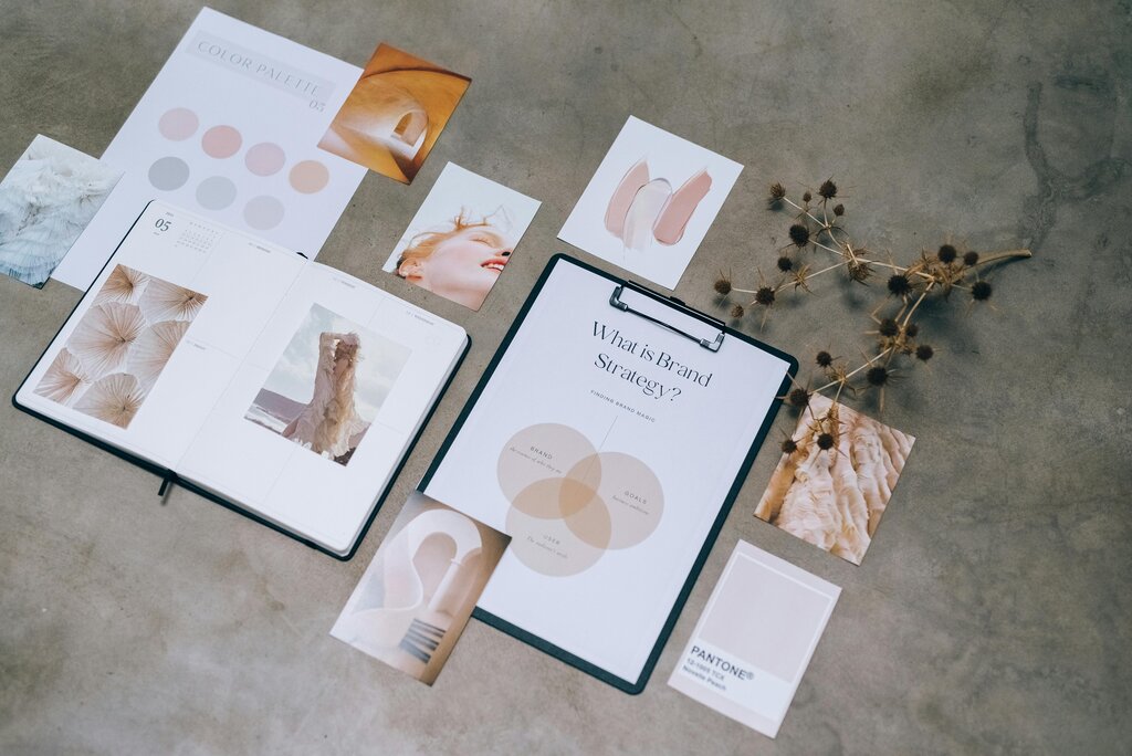
Design systems are the evolution of the style guide. They are living, breathing entities that go beyond visual identity. A design system includes not just the styles, but the components themselves—the actual building blocks of the interface, complete with code, documentation, and usage guidelines. It's a dynamic and interactive resource built for creating digital products.
The Core Components
A robust design system is made up of several key parts that work together. While they can vary, most include three core elements.
| Component | Purpose |
|---|---|
| Design Tokens | The foundational, indivisible pieces of the visual design. |
| Component Library | The collection of reusable UI elements built from tokens. |
| Documentation | The guidelines explaining how and why to use the system. |
Let's look at each one more closely.
Design Tokens are the smallest building blocks of the system. Think of them as variables that store visual information. Instead of defining a color as #333333, you might create a token called $color-text-primary. This token can then be used everywhere that color is needed. If you later decide to change that color, you only need to update the token, and the change will apply across the entire product.
Component Libraries are collections of reusable user interface (UI) elements. These are the functional pieces users interact with, like buttons, navigation bars, and form fields. Each component is built using design tokens and comes with its own set of rules and, crucially, its own code. This means a developer can grab a fully functional, on-brand button without having to build it from scratch.
Documentation is the instruction manual that holds everything together. It explains the purpose of the design system and provides clear guidelines on how to use its tokens and components. Good documentation covers principles, accessibility standards, voice and tone, and practical examples. Without clear documentation, a design system is just a folder of assets.
The Strategic Advantage
Implementing a design system requires an upfront investment of time and resources, but the long-term benefits are significant. It's a strategic tool that impacts the entire product development lifecycle.
By unifying design and development workflows, design systems create a shared language that breaks down silos and fosters collaboration.
The most immediate benefit is efficiency. Teams can build and ship products faster because they aren't reinventing the wheel with every new feature. Designers can quickly create mockups with pre-built components, and developers can implement them with reliable, pre-written code.
Another key benefit is consistency. A design system ensures a cohesive user experience across all platforms and products. When buttons, icons, and layouts behave predictably, users feel more confident and comfortable navigating the product. This consistency strengthens brand identity and builds user trust.
Finally, a design system makes it easier to scale. As a company and its product offerings grow, a design system ensures that new features and products maintain the same level of quality and coherence as the originals.
Time to check what you've learned.
What is the primary goal of a design system?
A design system is just a more modern term for a traditional brand style guide.
Ultimately, a design system is an investment in quality and speed. It allows teams to focus on solving complex user problems instead of redesigning basic UI elements.