Mastering Design Systems
Introduction to Design Systems
What Is a Design System?
Imagine trying to build a city where every architect uses their own unique style, different materials, and even their own measurements for what a 'meter' is. One building might have doors two meters high, while the one next door has them at three. The result would be chaotic and confusing. A design system prevents this kind of chaos in the digital world.
A design system is a collection of reusable components, guidelines, and standards that ensure consistency across a product’s design.
Think of it as a single source of truth for an entire team. It's a library of everything from colors and fonts to ready-to-use buttons and forms. This library isn't just for designers; it’s for developers, product managers, and anyone involved in creating a product. It ensures everyone is speaking the same language and building with the same set of tools.
Why Bother with a System?
Without a design system, a simple button might have five slightly different shades of blue across a single website. One team might spend weeks designing a new user profile page, only to find another team already built something similar. This wastes time, creates a clunky user experience, and makes products harder to maintain.
A design system solves these problems by creating a more efficient and collaborative workflow.
Products are built faster, designers and developers work together more smoothly, and the final result feels cohesive and professional to the user. Consistency builds trust and makes an application easier to learn and use.
The Building Blocks
Design systems are made up of several key components that work together. Let's look at the three most fundamental parts: design tokens, UI components, and documentation.
Design Token
noun
A variable that stores a visual design attribute, such as a color, font size, or spacing value.
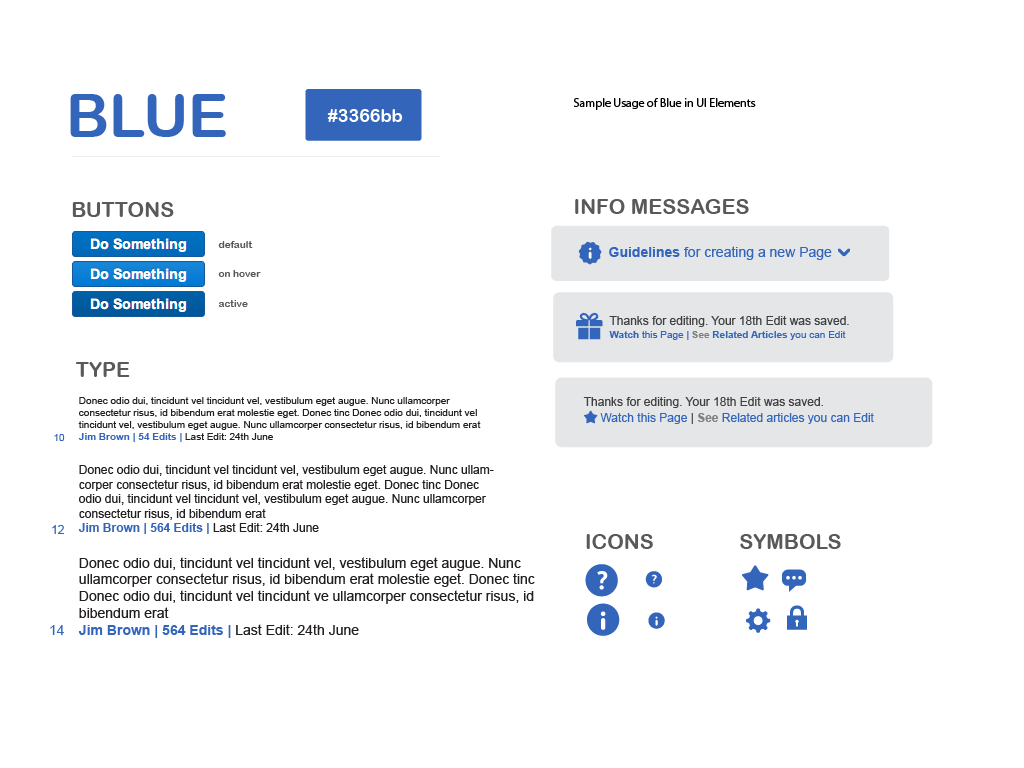
Design tokens are the atoms of your design system. They are the smallest, indivisible pieces that define the look and feel of your product. Instead of hard-coding a color like #3366bb every time you need it, you use a token, like $color-primary-blue. If you ever need to update your primary brand color, you just change the value of that one token, and the change applies everywhere.
/* design-tokens.css */
:root {
  --color-brand-primary: #3366bb;
  --font-size-medium: 16px;
  --spacing-small: 8px;
}

/* component.css */
.button {
  background-color: var(--color-brand-primary);
  font-size: var(--font-size-medium);
  padding: var(--spacing-small);
}
If design tokens are the atoms, then UI components are the molecules. They are the reusable parts of the user interface that you see and interact with. Think of buttons, text fields, dropdown menus, and navigation bars. These components are built using design tokens, ensuring they are always consistent with the overall brand style.
Finally, there's documentation. A design system is only useful if people know how to use it. Documentation is the instruction manual. It explains what each component is for, how to use it correctly, and provides guidelines on accessibility, tone of voice, and visual style.
Good documentation turns a simple library of parts into a powerful tool that anyone on the team can use to build great products.
What is the primary purpose of a design system in product development?
If UI components like buttons and menus are the 'molecules' of a design system, what are the 'atoms'?
A design system provides the foundation for building consistent, high-quality digital products efficiently. By starting with the smallest pieces—design tokens—and building up to larger components, teams can create a unified and scalable experience for their users.