Mastering Data Visualization
Introduction to Data Visualization
What Is Data Visualization?
Data visualization is the practice of turning raw data, like numbers and text, into a visual format. Think of it as translating a dense, complicated language into a simple, universal one: pictures. The goal is to make complex information easy to grasp at a glance, revealing patterns, trends, and outliers that might otherwise go unnoticed.
Imagine being handed a spreadsheet with thousands of rows of sales data. You could spend hours trying to make sense of it. Now, imagine seeing that same data as a simple line chart showing sales trends over the past year. You'd instantly know if sales were going up, down, or staying flat. That’s the power of visualization.
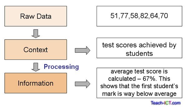
It’s a blend of art and science. The science part involves choosing the right kind of visual to accurately represent the data. The art part involves designing that visual in a way that is clear, compelling, and tells a story.
The main goal is to communicate information clearly and efficiently. A good visualization removes the noise and highlights the insight.
A Quick Trip Through Time
While digital tools have made data visualization more common, the practice is centuries old. The earliest forms were maps, which visualized geographic information. But the field really took off in the late 18th century with a Scottish engineer named William Playfair.
Playfair is credited with inventing several charts we still use constantly today, including the line graph, bar chart, and pie chart. He was one of the first to argue that pictures could communicate data far better than tables of numbers. Before him, presenting statistical data was a very dry affair.
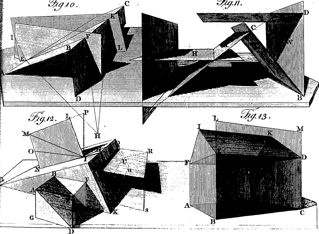
In the 19th century, others built on this foundation. Florence Nightingale, a nurse in the Crimean War, used a unique diagram she created, the “coxcomb chart,” to show that more soldiers were dying from poor sanitation than from battle wounds. Her powerful visualization convinced Queen Victoria and parliament to improve conditions in military hospitals, saving countless lives.
Core Principles of Good Visualization
Creating an effective visualization isn't just about making something look nice. It needs to be functional and honest. There are a few key principles to keep in mind.
| Principle | Description |
|---|---|
| Clarity | The visualization should be easy to understand. Avoid clutter, confusing colors, and unnecessary elements. |
| Accuracy | The visual must truthfully represent the data. Misleading charts can lead to wrong conclusions. |
| Efficiency | The viewer should be able to grasp the main message quickly without having to study the graphic for a long time. |
| Storytelling | A great visualization tells a story, guiding the audience through the data to a key insight or conclusion. |
These principles ensure that the visualization serves its primary purpose: to enlighten. A chart that is visually stunning but confusing or misleading is ultimately a failure.
Data visualization isn't just about making data pretty. It’s about turning complex information into clear, compelling stories that actually inspire people to act.
Visualization in the Wild
Data visualization is used in nearly every field imaginable. It helps us make sense of the world around us.
-
In Business, executives use dashboards to track key performance indicators (KPIs), helping them make quick, informed decisions about sales, marketing, and operations.
-
In Science, researchers visualize massive datasets to identify patterns. Climate scientists, for example, map global temperature changes to communicate the urgency of climate change.
-
In Journalism, news organizations use infographics and interactive maps to help readers understand complex issues, from election results to public health crises.
-
In Healthcare, doctors might use visualizations to track a patient's health metrics over time, making it easier to spot potential problems.
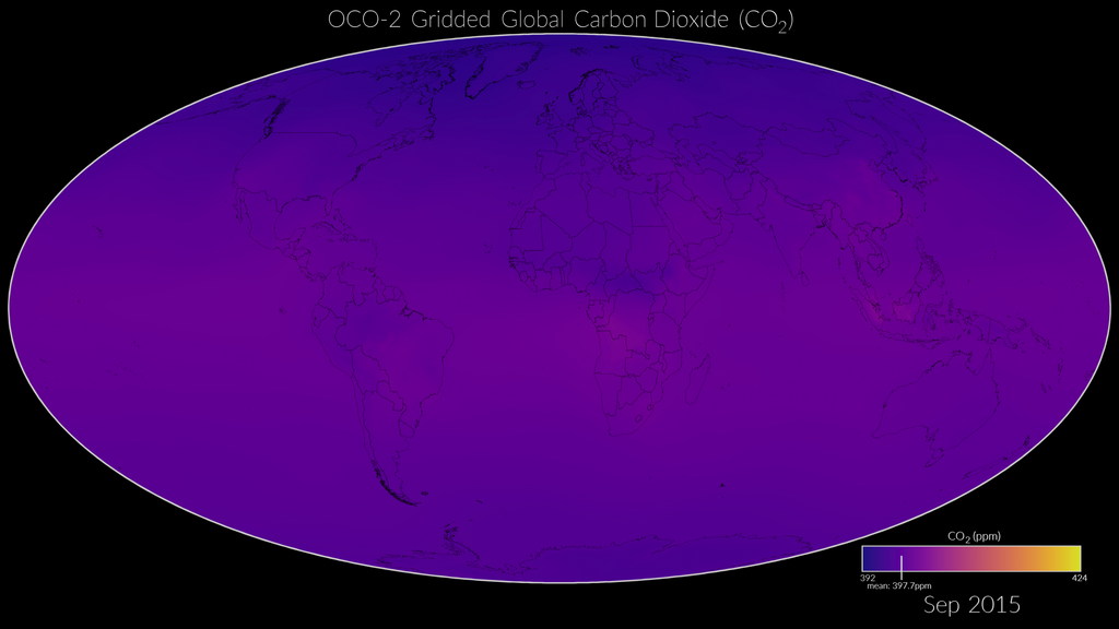
In each case, visualization transforms raw data into actionable knowledge. It empowers people to see what's happening, understand why, and decide what to do next.
What is the primary goal of data visualization?
Which historical figure is credited with inventing the line graph, bar chart, and pie chart?
You've now learned the what, why, and how of data visualization basics. It's a fundamental skill for anyone looking to make sense of the data-rich world we live in.