Mastering Copilot in Power BI
Introduction to Power BI
What Is Power BI?
At its heart, Power BI is a tool that turns raw data into clear, interactive visuals. Imagine you have spreadsheets full of sales numbers, customer information, and inventory levels. It can be hard to see the big picture. Power BI helps you connect to that data, process it, and create charts and graphs that tell a story. This makes it easier to spot trends, understand performance, and make smarter business decisions.
Power BI is a data visualization and business intelligence tool that allows users to connect to various data sources, clean and transform data, and build visual dashboards that tell compelling data stories.
It’s more than just a single application. Power BI is an ecosystem of services and tools that work together to bring your data to life. Let's break down the main components.
The Power BI Ecosystem
Power BI consists of three main parts that cater to different needs, from building reports to viewing them on the go.
| Component | Primary Use |
|---|---|
| Power BI Desktop | A free application for Windows where you design and build your data models and reports. This is where the heavy lifting happens. |
| Power BI Service | An online service (SaaS) where you publish your reports to share with others. It's used for collaboration and creating dashboards. |
| Power BI Mobile | Apps for Windows, iOS, and Android devices that let you view and interact with your published reports and dashboards anywhere. |
Typically, a business analyst or developer will use Power BI Desktop to connect to data sources and create a report. Once it's ready, they publish it to the Power BI Service. From there, colleagues can view the report in their web browser or on their phones using the Power BI Mobile app.
From Raw Data to Insight
Creating a report in Power BI follows a standard workflow. It starts with gathering your data, which can come from almost anywhere.
Power BI allows users to import data from multiple sources, including Excel, SQL databases, cloud services, and APIs.
Once you've connected to your data, the process generally involves four key steps:
Let's touch on the Transform & Model step, as it's crucial. Raw data is rarely perfect. You might need to clean it up—like removing errors or splitting columns. This is done in the Power Query Editor, a tool within Power BI Desktop.
After cleaning, you model the data. This involves defining relationships between different data tables. For example, you might link a Sales table to a Products table using a ProductID column. This allows you to analyze sales data by product category, price, or other attributes.
Think of data modeling as creating a blueprint for your data. It defines how different pieces of information relate to each other, making your analysis faster and more accurate.
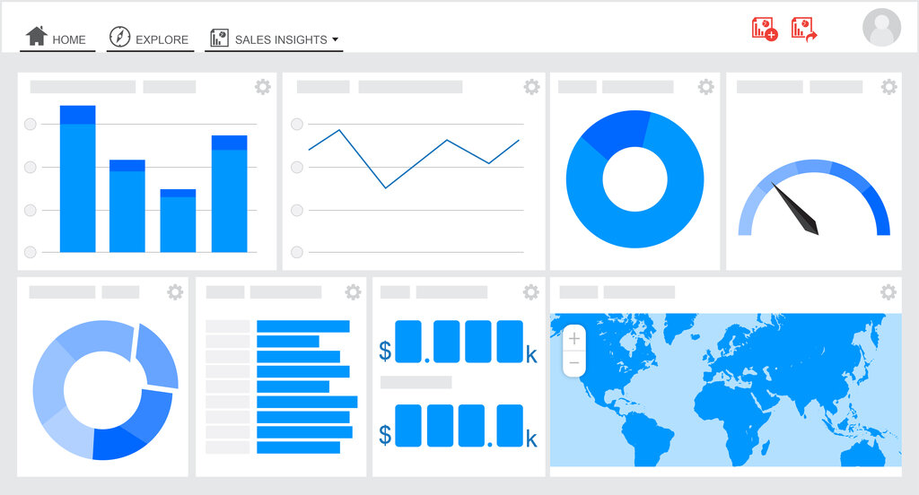
With a clean, well-structured data model, you can move on to the fun part: visualization. Power BI offers a wide range of visuals, from simple bar charts and pie charts to complex maps and funnel charts. You simply drag and drop data fields onto a canvas to create interactive reports.
Finally, you publish your report to the Power BI Service, where you can arrange visuals into a single-page view called a dashboard. This is what you share with your team or clients, allowing them to explore the data and discover insights for themselves.
What is the primary function of Power BI?
Which of the following are the three main components of the Power BI ecosystem for a typical user workflow?
This covers the fundamentals of what Power BI is and how it works. By connecting to data, shaping it, and creating compelling visuals, you can turn complex information into a clear story.