Mastering Color Grading
Introduction to Color Theory
The Color Wheel
Before you can grade color, you need to understand it. At the heart of color theory is a simple tool: the color wheel. It’s a visual map that shows how colors relate to one another. Think of it as a compass for your creative choices.
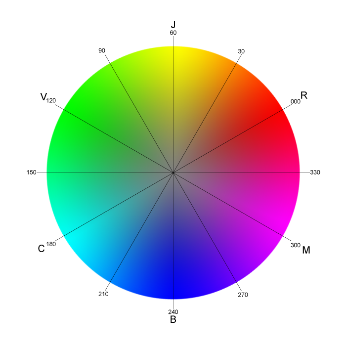
The wheel organizes colors in a logical sequence, making it easy to see the building blocks of every shade you see on screen. It all starts with three fundamental colors.
Building Blocks of Color
All colors are mixed from just a few base ingredients. These are grouped into three categories.
Primary Colors: Red, yellow, and blue. These are the foundation. You can't create them by mixing other colors together.
Secondary Colors: Orange, green, and violet. These are created by mixing two primary colors. Red and yellow make orange, yellow and blue make green, and blue and red make violet.
Tertiary Colors: These are the six shades that fill in the gaps. They’re made by mixing a primary color with an adjacent secondary color. This gives you colors like red-orange, yellow-green, and blue-violet.
Creating Harmony
Color harmony is about choosing colors that work well together. The simplest and most powerful harmony comes from complementary colors. These are colors that sit directly opposite each other on the color wheel. For example, red's complement is green, and blue's complement is orange.
When placed next to each other, complementary colors create a strong, vibrant contrast. This is a key technique in film and video to make subjects pop or to create a sense of tension and energy. The classic "orange and teal" look so common in movies is a direct application of this principle.
The color wheel is a fundamental tool in understanding color relationships.
The Feeling of Color
Colors aren't just visual information; they carry emotional weight. We have deep-seated psychological associations with different hues. A warm, golden light feels different from a cold, sterile blue. As a colorist, your job is to use these associations to help tell the story and guide the audience's feelings.
Understanding these connections is crucial. Changing the color palette of a scene can completely alter its mood without changing a single line of dialogue.
| Color | Common Psychological Associations |
|---|---|
| Red | Passion, anger, love, danger, energy |
| Orange | Warmth, excitement, enthusiasm, youth |
| Yellow | Happiness, optimism, warmth, caution |
| Green | Nature, growth, jealousy, health, tranquility |
| Blue | Calmness, sadness, stability, trust, coldness |
| Purple | Royalty, luxury, mystery, spirituality |
These are not hard rules, but cultural starting points. The meaning of a color can change based on its context, saturation, and the other colors around it. A bright, sunny yellow is cheerful. A sickly, muted yellow can feel unsettling. Mastering color grading is about learning to control these subtle emotional cues.
Ready to check your understanding?
What is the primary function of the color wheel in color theory?
How is the secondary color green created?
With these basics, you have a framework for making deliberate and impactful color choices. The color wheel isn't just a diagram; it's a guide to creating emotion and telling a better story.