Mastering Calligraphic Forms and Flourishes
Copperplate Letterform Nuance
The Angle of Elegance
Copperplate script is defined by its precision, and that precision starts with a consistent angle. Every downstroke should follow a strict 55-degree slant from the horizontal baseline. This isn't an arbitrary number; it's the angle that produces the most graceful and readable letterforms with a flexible nib. Maintaining this slant manually with a straight pen is difficult and requires an awkward wrist position.
This is why the oblique pen holder is essential. It's not a crutch, but a specialized tool engineered to achieve the correct angle naturally.
The flange on an oblique pen holder positions the nib at an offset angle relative to the pen's staff. This means you can hold the pen comfortably, pointing towards the top of your page, while the nib itself is perfectly aligned to create that 55-degree slant on every downstroke. The pen does the work of maintaining the angle, freeing you to focus on pressure and form. Without it, you'd be fighting your own wrist, and your script would show it.
Mastering the Swell
With the slant established, our focus shifts to line variation. The elegant transition from a hairline thin to a shaded thick is the soul of Copperplate. This effect, known as the 'swell', is created by applying pressure to the flexible nib, causing its two to spread apart. More pressure means a wider separation and a thicker line.
The foundational shape for practicing this is the oval. Nearly every lowercase letter in Copperplate is derived from this form. To execute it properly, start at the top with no pressure, descend along the 55-degree slant applying gradual pressure to swell the stroke to its maximum width at the curve's fattest point, then release pressure just as gradually as you ascend back to the top to complete the shape. The transition in and out of the swell should be seamless.
This isn't about simply pressing hard and letting go. It's a controlled crescendo and decrescendo of pressure, a skill that requires dedicated muscle memory.
Rhythm and Ratios
Individual strokes are only part of the equation. Professional calligraphy is judged on its consistency and rhythm across the entire page. This is achieved by adhering to strict proportions. The body of a lowercase letter, like 'a' or 'c', sits between the baseline and the waistline. This distance is called the and it is our basic unit of measurement.
Ascenders (the tops of letters like 'h' and 'l') and descenders (the bottoms of 'g' and 'p') are defined as multiples of the x-height. A common ratio in Copperplate is 2:1:2, meaning the ascender space and descender space are both twice the x-height. Some calligraphers prefer a 3:2:3 ratio. The key isn't which ratio you choose, but that you apply it with unwavering consistency. This mathematical harmony is what gives Copperplate its distinctive, flowing rhythm.
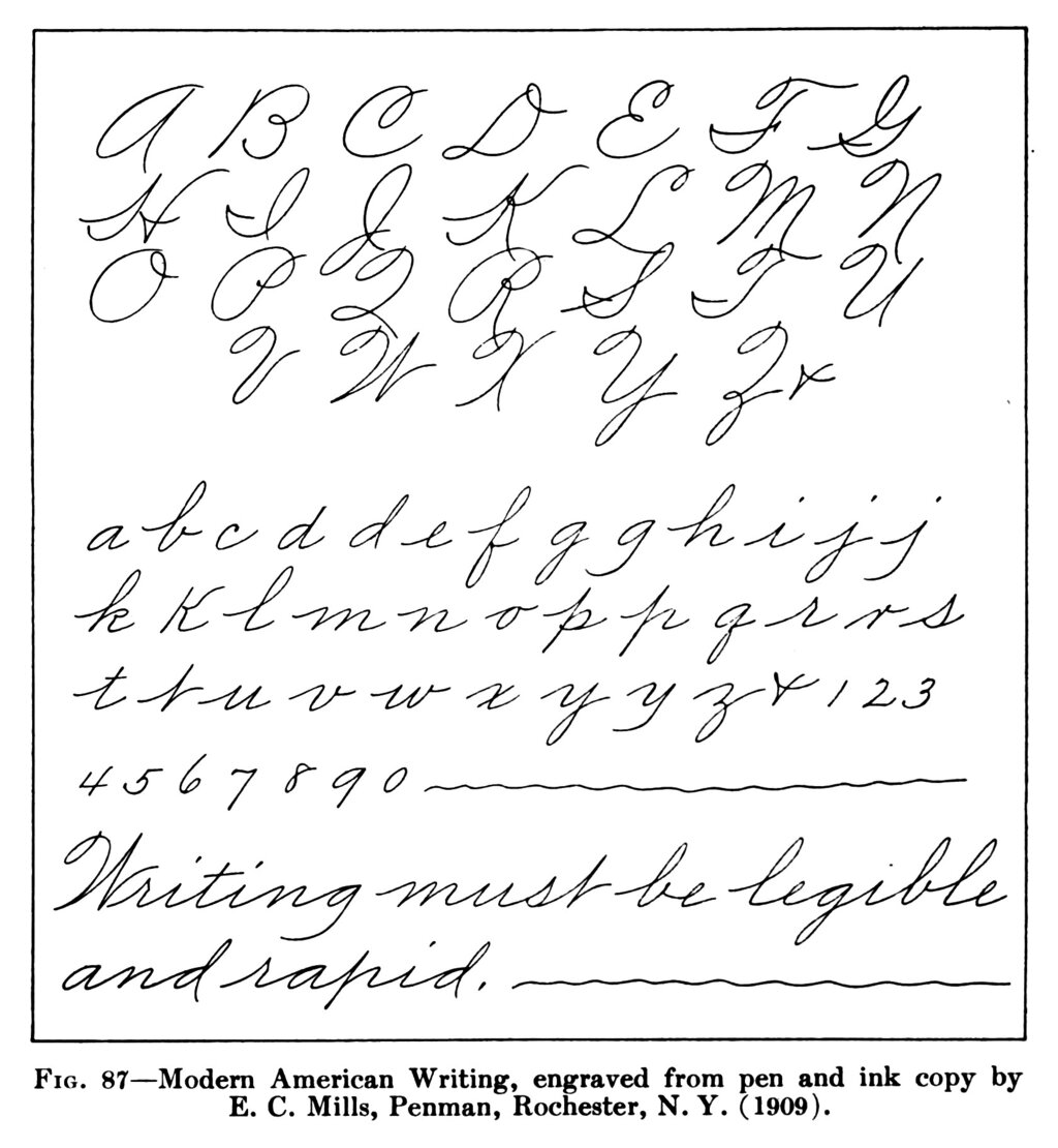
Once you internalize these geometric rules, your hand will begin to produce letters that are not just beautiful in isolation, but that dance together across the page. This is the transition from simply lettering to creating true calligraphy.
Ready to test your understanding of these fine points?
What is the standard slant angle for downstrokes in Copperplate script, measured from the horizontal baseline?
What is the primary function of the flange on an oblique pen holder in Copperplate calligraphy?