Mastering Academic Poster Presentations
Understanding Academic Posters
A Visual Conversation
Think of an academic poster as a movie trailer for a research paper. It’s a visual summary of a study, designed to grab attention and start a conversation. Researchers present posters at conferences and seminars to share their work, get feedback from colleagues, and connect with others in their field.
The main goal is to present complex information quickly and clearly. An attendee should be able to walk by, glance at your poster, and understand the core of your research in just a minute or two. If they're interested, they can stop and chat with you to learn more. This makes posters a dynamic and interactive way to share knowledge.
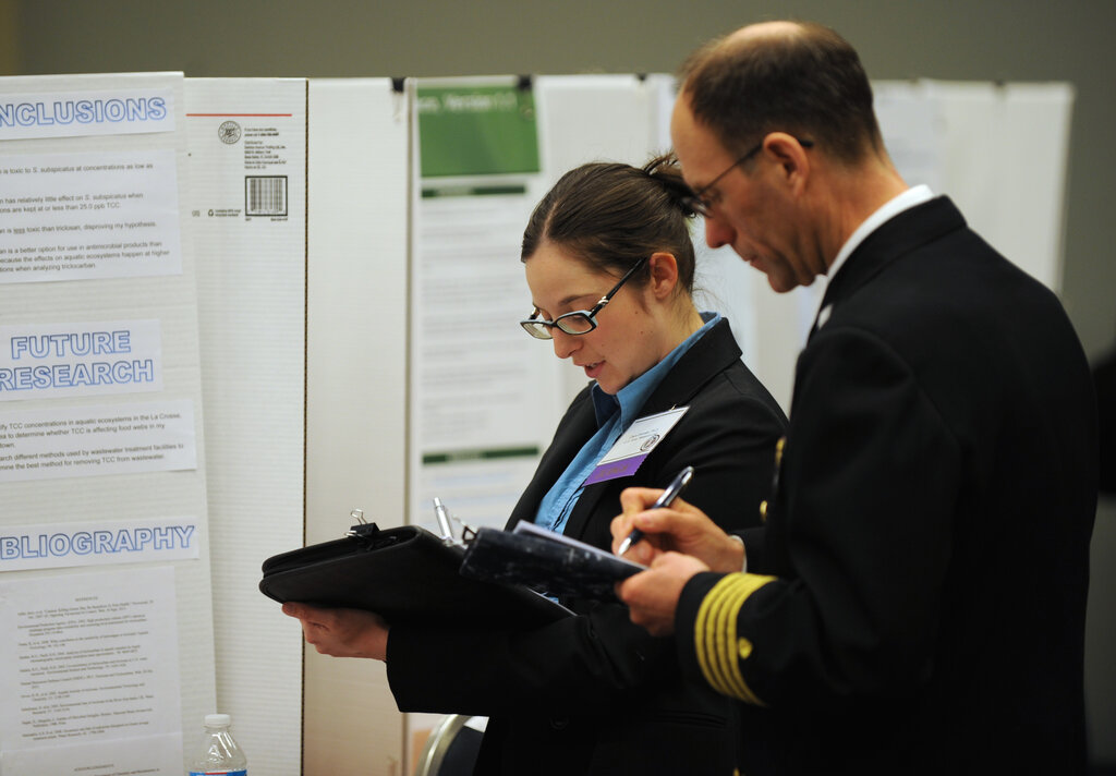
Poster vs. Podium
How is a poster session different from giving a traditional talk, like an oral presentation? While both aim to communicate research, they function very differently.
An oral presentation is like a lecture. The speaker controls the flow of information, and the audience listens passively, saving most questions for the end. It's a one-to-many form of communication.
A poster presentation is more like a conversation at a gallery opening. People can browse at their own pace, focusing on what interests them. The format allows for direct, one-on-one interaction between the researcher and the audience, leading to deeper discussions and more personal feedback.
| Feature | Poster Presentation | Oral Presentation |
|---|---|---|
| Pacing | Audience-controlled | Speaker-controlled |
| Interaction | High (one-on-one chats) | Low (formal Q&A) |
| Format | Visual summary | Linear narrative |
| Audience Size | Small, personal groups | Large, collective audience |
Anatomy of a Poster
While designs vary, most academic posters follow a standard structure. This predictable layout helps viewers find information quickly. The flow typically moves from top to bottom and left to right, much like reading a page in a book.
The key components are:
- Title, Authors, & Affiliations: A large, clear title at the top tells everyone what your project is about. Below that, you list who worked on it and where they're from.
- Introduction: A brief section that sets the stage. What problem did you study, and why is it important?
- Methods: A concise explanation of how you conducted your research. What steps did you take? What tools did you use?
- Results: The main event. This is where you present your key findings, often using charts, graphs, and images to make the data understandable.
- Conclusion: A summary of your main takeaways. What do your results mean, and what are the next steps?
- References & Contact: A small section to credit your sources and provide your email or social media handle for follow-up questions.
Clarity is Key
A successful poster hinges on clarity and visual appeal. You could have groundbreaking research, but if your poster is a dense wall of tiny text, no one will stop to read it. The goal is to make your information as accessible as possible.
This means using clear headings, bullet points, and plenty of white space to guide the reader's eye. Visuals like charts and graphs should be large, simple, and easy to interpret from a few feet away. Every element on the poster should have a purpose. If it doesn't help communicate your main message, it's just clutter.
A great poster isn't just a wall of text. It's a conversation starter.
Effectively summarizing complex work for a visual format is a real skill. As researchers note, it's a genuine challenge to present dense information from a paper in a way that is both accurate and visually digestible.
Generating accurate and concise textual summaries from multimodal documents is challenging, especially when dealing with visually complex content like scientific posters.
Now, let's test what you've learned about the fundamentals of academic posters.
What is the primary goal of an academic poster at a conference?
True or False: A poster presentation is considered a 'one-to-many' form of communication, similar to a lecture.
Academic posters are a powerful tool for sharing your work and connecting with others. By focusing on a clear structure and strong visual design, you can create an effective summary that sparks curiosity and invites discussion.