Mastering Academic Poster Presentations
Understanding Academic Posters
More Than Just a Big Page
Think of an academic poster as a movie trailer for a research project. In a busy conference hall, you have just a few moments to grab someone's attention and tell them why your work matters. A poster isn't a full research paper stuck to a board; it's a visual summary designed to start a conversation.
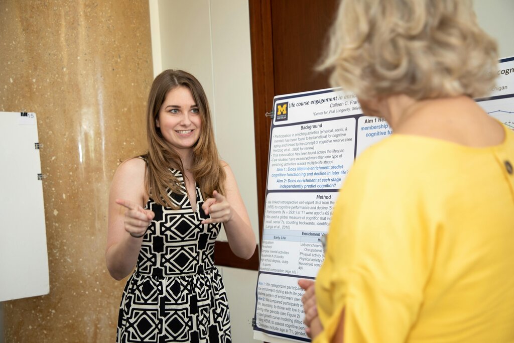
The main goal is to communicate your key findings quickly and clearly to a wide audience. This includes experts in your field, researchers from other disciplines, and students. Your poster should be an efficient, standalone summary that sparks curiosity and invites questions.
Anatomy of a Poster
Most academic posters follow a standard structure, much like a research article. The layout guides the viewer through your research story in a logical flow, typically from top to bottom and left to right.
Here are the essential components:
- Title and Authors: The title should be short, sharp, and interesting. It's the first thing people read. The author list shows who did the work and where they're from.
- Introduction: This section provides brief context. What problem did you investigate, and why is it important? It should end with your main research question or hypothesis.
- Methodology: A concise explanation of what you did. How did you collect and analyze your data? Visuals like flowcharts can be very effective here to simplify complex processes.
- Results: This is the heart of the poster. Present your key findings using charts, graphs, and images. The visuals should be clear and largely self-explanatory. Keep text to a minimum, using captions to explain the graphics.
- Conclusion: What do your results mean? Briefly summarize your main takeaways and suggest what the next steps might be. This section answers the "so what?" question.
- References & Contact Info: A small section for key citations and your contact information (like an email or social media handle) so people can follow up.
Making It Stick
An effective poster balances information with readability. The design isn't just about looking good; it's about making your research accessible.
A well-designed poster should be able to stand alone, conveying the key points of your research even when you're not present to explain it.
Clarity and conciseness are your best friends. Use bullet points instead of dense paragraphs. Choose simple, direct language and avoid jargon wherever possible. The average viewer will only spend a few minutes at your poster, so every word and image must count.
Think in headlines, not paragraphs. Your goal is to deliver the main message at a glance.
Visual appeal is also crucial. A clean, organized layout with a logical flow helps guide the reader’s eye. Using a consistent color scheme and easy-to-read fonts can make your poster inviting from across the room. The visuals should dominate, with text serving a supporting role to explain the key takeaways.
Let's review the core components of an academic poster.
Now, test your understanding of the purpose and structure of academic posters.
What is the primary goal of an academic poster?
Which section of the poster is considered its 'heart' and should be dominated by visuals like charts and graphs?
Ultimately, a poster is a powerful tool for sharing your work. By focusing on a clear message, a logical structure, and strong visuals, you can create a poster that effectively communicates your research and starts meaningful conversations.