Mastering Academic Poster Presentations
Understanding Academic Posters
The Research Snapshot
An academic poster is a visual summary of your research. Think of it not as a paper pinned to a board, but as a conversation starter. At conferences and symposiums, hundreds of researchers share their work. A poster is your chance to present your findings in a way that's quick to grasp and visually engaging.
Scientific posters play a vital role in academic communication by presenting ideas through visual summaries.
The goal is to distill complex information into key takeaways. Someone walking by should be able to understand the essence of your project in just a few minutes. If they’re interested, they can stop and chat with you to learn more. The poster is the hook.
Anatomy of a Poster
While designs can be creative, most academic posters follow a standard structure. This familiar format helps viewers quickly find the information they're looking for. It typically mirrors the sections of a research paper, but in a highly condensed form.
Key components almost always include:
- Title and Authors: Large and clear, stating the project and who did the work.
- Introduction: A brief overview of the research question and its importance.
- Methods: A concise explanation of how the research was conducted.
- Results: The key findings, often presented visually through charts or graphs.
- Conclusion: A summary of the main takeaways and implications of the work.
Some posters also include sections for discussion, references, and acknowledgements, but brevity is always key.
Designing for a Glance
A poster session is a busy environment. Your audience is often wandering through a room full of posters, so you have only a few seconds to catch their eye. The design needs to be clear, logical, and easy to read from a distance.
A well-designed poster should be able to stand alone, conveying the key points of your research even when you're not present to explain it.
The first principle is to prioritize clarity. Use simple language, short sentences, and bullet points to break up text. Avoid dense paragraphs and unnecessary jargon. The less text, the better. Let your visuals do the heavy lifting.
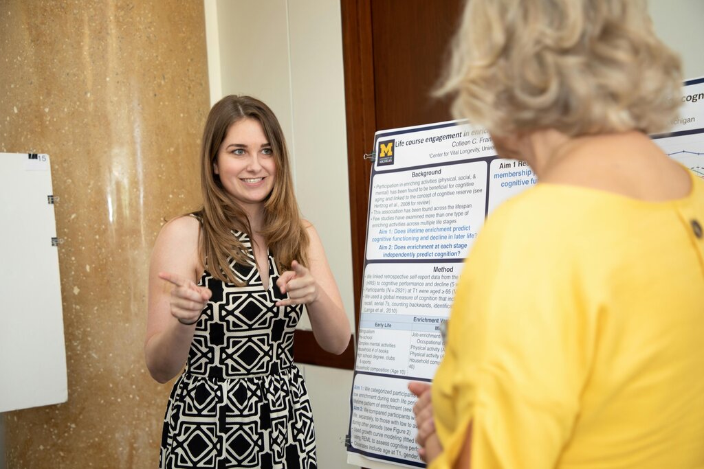
Visual elements like graphs, charts, and images are crucial. They can convey data and complex ideas far more effectively than a block of text. Make sure they are high-quality and directly support your key points.
Every visual should tell a story or clarify a point. If it doesn't, leave it out.
Finally, think about visual hierarchy. This is the art of arranging elements to guide the viewer's eye through the poster in a logical order. Use different font sizes for headings and body text. Use color and white space strategically to separate sections and highlight important information. The most critical takeaway should be the most prominent thing on the poster.
Visual hierarchy helps guide viewers’ eyes through your poster in a logical order.
What is the primary goal of an academic poster at a conference?
Which of these is considered an essential component of nearly all academic posters?
Understanding these core principles is the first step toward creating a poster that effectively communicates your hard work.