Masonry Layouts with HTML and CSS
Introduction to CSS Grid
The Power of Two Dimensions
For years, arranging elements on a webpage felt like a puzzle with missing pieces. We used floats and positioning tricks to create layouts, but it was often complicated and fragile. Then came Flexbox, which made one-dimensional layouts—arranging items in a single row or a single column—much easier.
But what about layouts that need both rows and columns? Think of a photo gallery, a newspaper-style article, or a complex dashboard. This is where CSS Grid shines. It's a two-dimensional layout system designed specifically for this purpose.
The CSS Grid Layout Module offers a grid-based layout system, with rows and columns, making it easier to design web pages without having to use floats and positioning.
Grid lets you control the layout in both directions at once, giving you precise control over where your content goes.
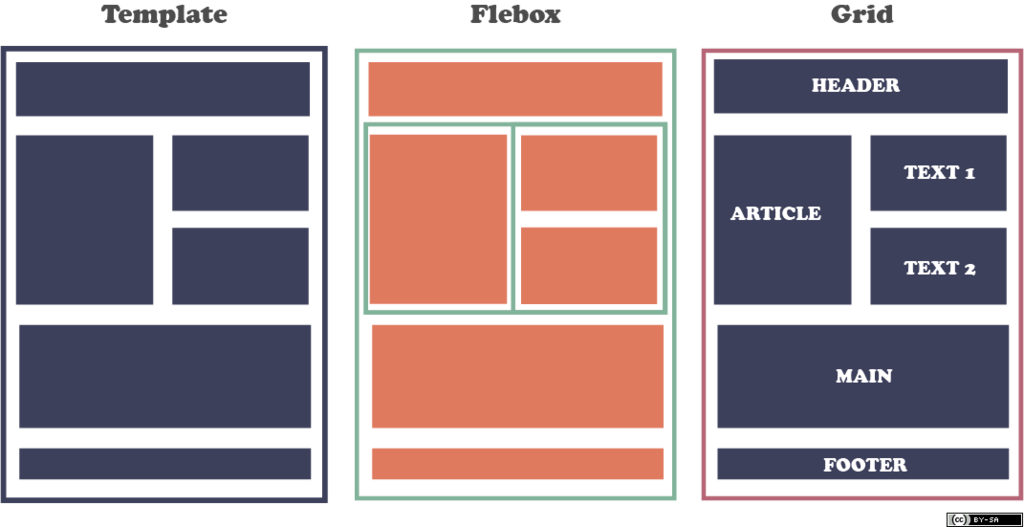
Grid Containers and Items
To start using Grid, you need two things: a grid container and grid items. The container is the parent element, and the items are its direct children. You create a grid container by setting its display property to grid.
<!-- HTML Structure -->
<div class="grid-container">
  <div class="grid-item">1</div>
  <div class="grid-item">2</div>
  <div class="grid-item">3</div>
  <div class="grid-item">4</div>
  <div class="grid-item">5</div>
  <div class="grid-item">6</div>
</div>

/* CSS */
.grid-container {
  display: grid;
}
Once you set display: grid, you've established a grid context. However, it won't look like much yet. All the items will stack on top of each other in a single column. The next step is to define the structure of your grid.
Defining Rows and Columns
You define the grid's structure with grid-template-columns and grid-template-rows. These properties let you specify the size and number of columns and rows.
You can use familiar units like pixels (px) or percentages (%). But Grid introduces a new, powerful unit: the fractional unit (fr). An fr unit represents a fraction of the available space in the grid container. This makes creating flexible, responsive layouts incredibly simple.
For example,
grid-template-columns: 1fr 2fr;creates two columns. The second column will always be twice as wide as the first, no matter the size of the container.
Let's create a simple three-column layout where each column takes up an equal amount of space.
.grid-container {
  display: grid;
  /* Creates three columns of equal width */
  grid-template-columns: 1fr 1fr 1fr;
  /* Creates two rows, each 100px tall */
  grid-template-rows: 100px 100px;
}
This CSS tells the browser to create a grid with three columns, each taking one fraction of the available width. It also defines two rows, each with a fixed height of 100 pixels.
Adding Space
What about the space between the grid items? In the past, this required careful use of margins, which could be tricky. Grid makes this incredibly easy with the gap property (previously known as grid-gap).
You can set a single value for gap to apply to both rows and columns, or you can specify them individually with row-gap and column-gap.
.grid-container {
  display: grid;
  grid-template-columns: 1fr 1fr 1fr;
  grid-template-rows: 100px 100px;

  /* Add a 10px gap between all items */
  gap: 10px;

  /* Or be more specific:
  row-gap: 20px;
  column-gap: 10px;
  */
}
This one property neatly creates a gutter between your grid items without any extra math or hacks. The gap is only applied between items, not on the outer edges of the container.
These are the fundamental building blocks of CSS Grid. By defining a container and setting up your tracks with columns and rows, you can start building powerful, predictable, and maintainable layouts for your web projects.