Manager Dashboard and Mini-App Experience Design
Introduction to Manager Dashboards
Your Business at a Glance
Think about the dashboard in your car. In a single glance, you can see your speed, fuel level, and engine temperature. It gives you all the critical information you need to operate the vehicle safely and efficiently. A manager dashboard does the same thing, but for a team, a project, or an entire company.
It’s a visual display of your most important information, consolidated and arranged on a single screen so you can monitor performance at a glance. The main purpose is to transform raw data into actionable insights, helping managers make faster, more informed decisions.
What Makes a Dashboard Work
Effective dashboards aren't just a random collection of charts. They are carefully designed tools built from a few key components.
First are the Key Performance Indicators (KPIs). These are the vital signs of your operation. A KPI is a measurable value that shows how effectively a company is achieving key business objectives. For a sales team, a KPI might be 'monthly recurring revenue.' For a marketing team, it could be 'website conversion rate.' A good dashboard focuses only on the most critical KPIs, avoiding clutter.
Next is data visualization. Humans are visual creatures. We can process images far more quickly than spreadsheets full of numbers. Dashboards use charts, graphs, and maps to represent data, making it easy to spot trends, patterns, and outliers. A line chart can show sales growth over time, while a pie chart can break down revenue by product category.
Finally, all of this is wrapped in a user interface (UI). The UI is the look and feel of the dashboard. A good UI is intuitive and easy to navigate. Information should be organized logically, with the most important data displayed prominently. The goal is to help a manager find answers to their questions quickly, without needing a user manual.
Why Use a Dashboard?
When designed well, dashboards offer significant benefits. They foster enhanced decision-making by providing real-time data. Instead of waiting for a weekly report, a manager can see performance as it happens and react quickly to new opportunities or challenges.
Dashboards also create transparency. When everyone on the team can see the same KPIs, it aligns them around common goals. It becomes clear what the priorities are and how individual contributions affect the bigger picture. This shared understanding can boost motivation and accountability.
Finally, they drive operational efficiency. By highlighting bottlenecks or areas of underperformance, dashboards help managers allocate resources more effectively. They can spot a problem before it becomes a crisis, saving time and money.
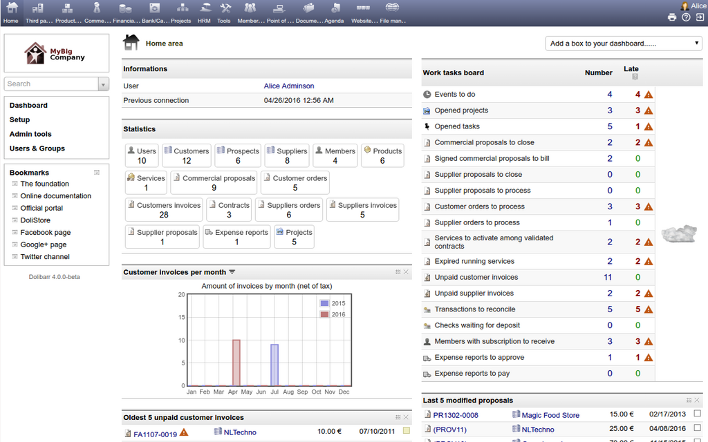
The whole point of a dashboard is to summarize key information (such as key performance indicators, or KPIs) so you can analyze it at a glance.
Simple Rules for Good Design
An effective dashboard is one that communicates information clearly and quickly. It's not about cramming as much data as possible onto one screen. Here are a few basic principles to keep in mind:
| Principle | Why It Matters |
|---|---|
| Know Your Audience | A dashboard for a CEO will look different from one for a project manager. Show the metrics that matter most to the person using it. |
| Keep It Simple | Focus on a handful of essential KPIs. Too much information creates noise and makes it harder to see what's important. |
| Use Visuals Wisely | Choose the right chart for the data. A line chart is great for showing a trend over time, while a bar chart is better for comparing categories. |
| Provide Context | A number on its own means little. Is $50,000 in monthly sales good? Compare it to the goal or to the previous month's performance to give it meaning. |
By following these guidelines, a dashboard becomes more than just a data display. It becomes a powerful tool for understanding performance and driving improvement.
What is the primary purpose of a manager dashboard?
Which component of a dashboard is responsible for its overall look, feel, and ease of navigation?
A well-crafted dashboard provides clarity, turning complex data into a simple story that guides better business decisions.