Making E-books Visually Engaging
Understanding Visual Design
The Language of Visuals
Good design is like a quiet conversation. It doesn't shout; it communicates clearly and effectively. When you're creating an e-book, your goal is to make the reading experience seamless and enjoyable. The principles of visual design are your tools for achieving this. They help you arrange elements on a page in a way that makes sense, guides the reader's eye, and supports the story you're telling.
The principles of design suggest how a designer can best arrange the various components of a page layout to connect to the overall design and to one another.
Think of it less as a set of rigid rules and more as a guide to creating a visual language. This language is built on a few core components: color, typography, and layout. When used thoughtfully, these elements work together to create a cohesive and professional feel.
Color and Mood
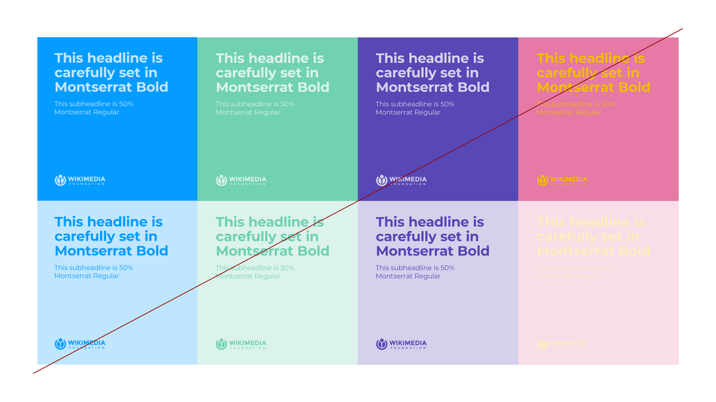
Color is one of the most powerful tools in your design kit because it evokes emotion. The colors you choose can instantly set the tone for your e-book. Warm colors like red and orange often feel energetic and passionate, while cool colors like blue and green tend to feel calm and stable.
A good place to start is with a basic color wheel. Primary colors (red, yellow, blue) are the foundation. Mixing them creates secondary colors (orange, green, purple). Combining those gives you a full spectrum to work with.
You don't need dozens of colors. A simple, consistent color palette of two or three colors is often more effective. The most important consideration is readability. Your text must have enough contrast with the background to be read easily. Black text on a white background is the classic example of high contrast, but other combinations work too. Just be sure to test them.
Typography Speaks Volumes
Typography is the art of arranging text to make it legible, readable, and appealing. The fonts you choose say a lot about your e-book's personality.
Fonts generally fall into two main categories:
| Font Type | Description | Common Feel |
|---|---|---|
| Serif | Has small decorative strokes (serifs) at the ends of letters. | Traditional, formal, classic. |
| Sans-serif | Lacks the decorative strokes. "Sans" means "without." | Modern, clean, informal. |
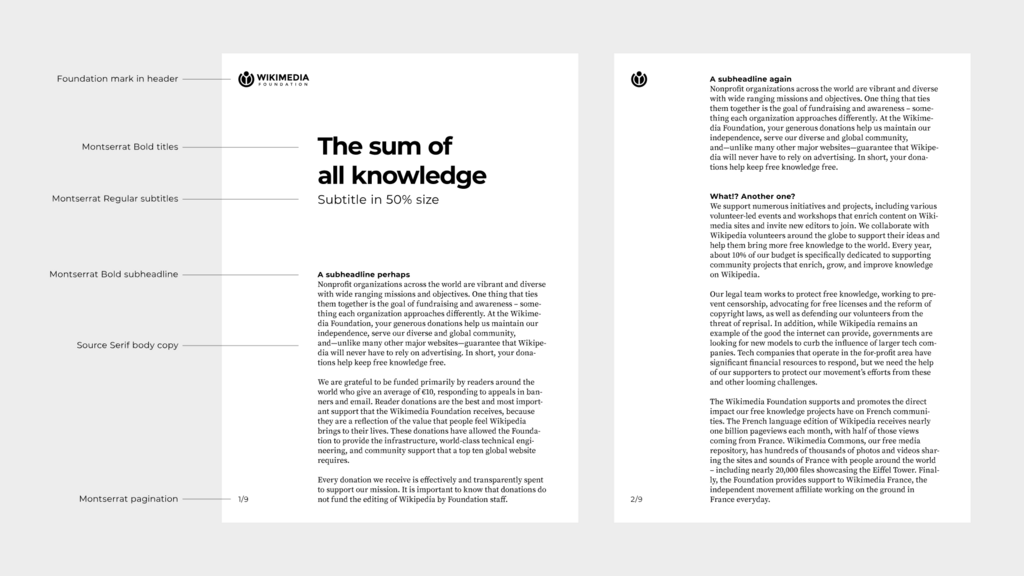
Many designers pair a sans-serif font for headings with a serif font for body text, or vice versa. This creates a pleasing contrast. Like color, limit yourself to two or three fonts to maintain consistency.
Beyond font choice, creating a clear typographic hierarchy is key. This means making your headings, subheadings, and body text look distinct from one another. You can achieve this by varying the font size, weight (bold, regular), and style. This hierarchy acts as a visual signpost, helping readers navigate the content and understand its structure at a glance.
Layout and Composition
Layout and composition are about how you arrange all the elements—text, images, headings—on the page. A good layout feels balanced and intuitive. A few key principles can help you get there.
Proximity
noun
The principle of grouping related items together. When elements are close to one another, we perceive them as a single unit. For example, an image caption should be placed right next to its image.
White Space: This is the empty space on the page, the areas with no text or images. Don't be afraid of it! White space reduces clutter, improves readability, and can be used to draw attention to important elements. It gives your content room to breathe.
Alignment: Aligning elements to a consistent grid creates a sense of order and connection. When text and images are aligned, the page looks clean and organized, not random and messy.
Repetition: Consistency is your best friend. Repeating design elements like colors, fonts, and heading styles throughout your e-book creates a cohesive experience. It ties the whole project together and makes it feel professional and intentional.
Together, these principles help you build a visual structure. This structure guides your readers through the content, making it easier for them to absorb the information without getting distracted by a confusing layout.
Let's review these concepts before moving on.
Now, let's test your understanding of these core principles.
According to the principles of visual design, what is the primary purpose of using white space in an e-book layout?
If you wanted to create an energetic and passionate tone for your e-book, which color palette would be the most effective choice?
By keeping these fundamentals in mind, you can create an e-book that is not only informative but also visually engaging and a pleasure to read.