Logo Presentation Deck Design
Understanding Logo Design Principles
The Anatomy of a Great Logo
A logo is a brand's face. It’s often the first thing people see, and it needs to communicate a lot in a small space. But what separates an iconic logo from a forgettable one? It's not just about looking good. Great logos are built on a few core principles that ensure they are effective, strategic, and lasting.
Simplicity Is Strength
The most effective logos are often the simplest. Think about the logos you can easily draw from memory. Chances are, they are clean and uncomplicated. A simple design is easy for the brain to process and remember. It cuts through the noise of a visually crowded world.
When a logo is simple, it's instantly recognizable, whether it's seen for a split second on a passing truck or in a small app icon on a phone screen. Complexity can be confusing and makes a logo harder to recall. The goal is clarity, not clutter.
Remember that every great logo reflects the tone and value of the brand through simplicity.
Look at the logos for major tech or media companies. They are often stripped down to their most essential elements.

Memorable and Versatile
A great logo should be memorable. It should stick in your audience's mind after just a few encounters. Simplicity plays a huge role here, but so does distinctiveness. A memorable logo has a unique quality that sets it apart from the competition.
Beyond being memorable, a logo must be versatile. It has to work everywhere the brand exists. This means it needs to look good:
- In black and white just as well as in color.
- At a massive scale on a billboard or tiny on a business card.
- On a dark background or a light one.
- In different layouts, like horizontal or stacked.
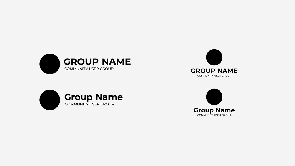
A design that relies heavily on intricate details or a specific color gradient will fail the versatility test. It will become a muddy, unrecognizable shape when shrunk down. Always design for flexibility.
Relevance and Timelessness
A logo must be relevant to the brand it represents. The design choices—from color to typography to imagery—should align with the industry and the brand’s personality. The logo for a bank should inspire trust and stability, while the logo for a children's toy company should feel fun and playful.
At the same time, a logo should be timeless. Chasing the latest design trend can make a logo feel dated in just a few years. The strongest logos feel classic and enduring. They are built on solid design foundations rather than fleeting fads, ensuring they remain effective for decades.
A logo doesn't just identify a company; it tells a story about its values and what it offers.
Common Pitfalls to Avoid
Many aspiring designers fall into the same traps. Avoiding them is crucial for creating a professional and effective logo.
| Pitfall | Why It's a Problem | How to Avoid It |
|---|---|---|
| Overly Complex | Difficult to remember and doesn't scale well. Details are lost when the logo is small. | Focus on a single, strong idea. Prioritize clean lines and shapes. |
| Too Trendy | Designs based on current fads quickly look dated, requiring frequent redesigns. | Study classic, long-lasting logos. Focus on timeless design principles. |
| Poor Font Choice | Illegible, generic, or inappropriate fonts can undermine the brand's message. | Choose a font that is readable at all sizes and reflects the brand's personality. |
| Relying on Color | The logo becomes unrecognizable in black and white or for viewers with color blindness. | Design in black and white first. A strong logo works based on its shape and form alone. |
By keeping these core principles in mind, you can create logos that are not just visually appealing, but are also powerful assets for any brand. Now, let's test your understanding.
According to logo design principles, why is a simple design often the most effective?
A logo is considered versatile if it works well...
Building a strong logo is about strategic thinking. It requires a deep understanding of the brand and a commitment to clarity and function.