Logo Design Fundamentals
Introduction to Logo Design
The Face of a Brand
A logo is a visual symbol that represents a company, product, or organization. Think of it as a face. Just like you can recognize a friend in a crowd, a good logo makes a brand instantly recognizable. It's a visual shortcut that communicates who the brand is and what it stands for.
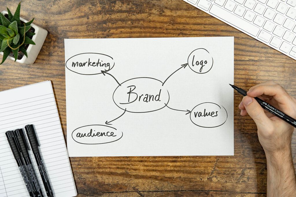
But a logo is just one piece of the puzzle. It works alongside other elements like colors, fonts, and tone of voice to build a complete brand identity. Its main job is to be memorable and to differentiate a brand from its competitors. When you see the golden arches, you don't need to read the words "McDonald's" to know what you're looking at. That's the power of a strong logo.
While a logo is sometimes the linchpin that holds a brand identity together and makes it instantly recognisable, brands aren't built on logos alone.
Common Logo Types
Logos aren't all the same. They can be broken down into a few common categories, each with its own strengths. Many of the world's most famous brands use one of these four types.
Wordmark
noun
A font-based logo that focuses on the business name alone. Also known as a logotype.
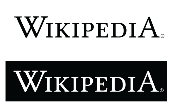
Wordmarks are straightforward and effective, especially for companies with unique names. Think of Visa, Coca-Cola, or NASA. The typography itself becomes the visual identifier.
Next up are pictorial marks, or logo symbols. These are icons or graphic-based designs that represent the brand.
A pictorial mark is what we think of when we hear the word "logo": an image that is easily recognizable and represents something. The iconic Apple logo or the Twitter bird are great examples.
A close cousin to the pictorial mark is the abstract mark. Instead of being a recognizable image, like an apple or a bird, it's a more abstract geometric form that represents the business. The logos for Pepsi and Nike are well-known abstract marks. They don't directly depict a product, but they evoke a feeling or idea associated with the brand.

Finally, we have combination marks. As the name suggests, this type of logo combines a wordmark with a pictorial or abstract mark. The symbol and text can be laid out side-by-side, stacked on top of each other, or integrated together to create a single image.
This is a popular choice for many businesses because the name is clearly associated with the image, reinforcing brand recognition. Brands like Doritos, Burger King, and Lacoste all use combination marks.
Understanding these basic types is the first step in appreciating logo design. Each style offers a different way for a brand to make its mark and connect with its audience.