Lead Capture Form Design
Architectural Design Patterns
Architecture of Persuasion
You already know the goal: turn a visitor into a lead. The real question is how. The structure of your lead capture form is just as important as the questions you ask. It’s the difference between a conversation and an interrogation. Your first major decision is choosing between a single, comprehensive page or a multi-step journey.
The One-Page Form
A single-page form puts all the fields on one screen. It's direct and transparent. The user sees exactly what's required from the start. This works well for simple requests, like a newsletter signup or a basic contact form, where you only need a few pieces of information. For these short interactions, a single page is efficient and reduces clicks.
The downside emerges as the number of fields grows. A long, scrolling form can feel overwhelming, creating high initial cognitive load. When a user first lands on the page, a wall of input boxes can trigger immediate abandonment before they've even started. The perceived effort is just too high.
The Power of Momentum
Multi-step forms break the process into smaller, manageable chunks. Instead of one long page, the user moves through a series of shorter screens. This approach leans heavily on a few key psychological principles.
First, you can start with easy, low-friction questions, like a name or email address. Once a user answers that first question, the Endowment Effect kicks in. They've invested a small amount of effort and now feel a sense of ownership over the process. This creates momentum.
As they progress, another principle takes hold: the . Having already completed a few steps, users are more reluctant to abandon the form. They think, "I've already come this far, I might as well finish." This makes them more likely to answer more demanding questions, like budget or company size, later in the flow.
This strategy transforms a daunting task into a series of small, achievable wins.
Guiding the User
If you choose a multi-step form, you must show users where they are in the process. This is where the Breadcrumb Technique comes in. A simple progress bar or a series of numbered steps (e.g., "Step 1 of 3") provides a clear visual indicator of progress. It manages expectations and reduces anxiety by answering the question, "How much longer will this take?"
A progress bar reassures the user that their effort is leading toward a defined endpoint.
There are a few common ways to present a multi-step form:
- Accordion: The form expands downwards as the user completes each section. This keeps them on a single page but reveals fields progressively. It works well when sections are logically distinct.
- Modal Overlay: The form appears in a pop-up window over the current page. This focuses user attention but can sometimes feel intrusive. It's best for short, critical actions.
- Full-Page Form: The user is taken to a dedicated landing page for the form. This eliminates all other distractions, creating a focused environment solely for lead capture. This is the best choice for high-value conversions where you need the user's undivided attention.
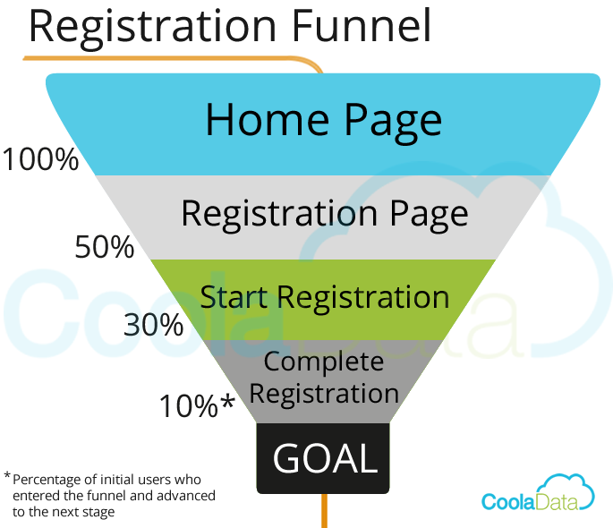
Ultimately, the choice between a single-page or multi-step form depends on your goal and your audience. For a quick sign-up, keep it simple. For a detailed qualification process, build momentum with a multi-step journey.