Landing Page Design for Beginners
Understanding Landing Pages
The One-Job Web Page
Imagine you walk into a store. In a big department store, you can browse dozens of aisles, look at hundreds of different products, and maybe ask for directions. In contrast, a pop-up shop might sell just one thing: the perfect winter coat. You go in for that coat, and every part of the shop is designed to help you decide if it's right for you.
A typical website is like that department store. The homepage has a menu, links to an 'About' page, a blog, and different product categories. It’s designed for exploration.
A landing page is like that pop-up shop. It’s a standalone web page created for a single, focused purpose. When a user clicks on an ad or a marketing email, they don't land on a busy homepage. They land on a page with one specific goal, known as a conversion.
A conversion is the specific action you want a visitor to take, like signing up for a newsletter, downloading an ebook, or making a purchase.
By removing all other distractions, a landing page makes it much more likely that a visitor will take that one desired action. It's a direct conversation with a potential customer about one specific offer.
Landing Page vs. Homepage
The main difference between a landing page and other web pages, like a homepage, is focus. A homepage serves many purposes and speaks to a broad audience. A landing page has a single purpose and speaks to a specific audience that arrived from a particular marketing channel.
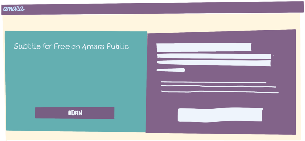
Notice how the page above has no navigation menu at the top. There are no links to a blog or a contact page. This is intentional. It removes exit paths and keeps the visitor focused on the offer. Here’s a quick breakdown of the differences:
| Feature | Homepage | Landing Page |
|---|---|---|
| Goal | Encourage exploration | Drive a single action (conversion) |
| Links | Many (navigation, footer, etc.) | Few to none, besides the main call-to-action |
| Audience | General visitors | Targeted traffic from a specific campaign |
| Content | Broad overview of a brand or company | Focused on a single offer or message |
Anatomy of an Effective Page
While designs vary, great landing pages share a few key elements. Think of them as the essential ingredients for a recipe that gets results.
Let's break these down:
- Headline: This is the first thing a visitor reads. It needs to be clear, concise, and match the message of the ad they just clicked. It answers the question, "Am I in the right place?"
- Persuasive Copy: This isn't about listing features. It's about explaining the benefits. How will this offer make the user's life better? The copy should be easy to scan, using bullet points or short paragraphs.
- Call-to-Action (CTA): This is the most critical element. It's a button or link that tells the user exactly what to do next. The language should be action-oriented, like "Get Your Free Trial" instead of just "Submit."
An effective landing page should only have one call to action whether it's subscribe, buy now, or sign up here.
- Visuals: A relevant image or video can communicate the value of your offer much faster than text alone. It helps the visitor visualize themselves using the product or service.
- Social Proof: People trust other people. Including testimonials, customer logos, or positive reviews builds credibility and reduces anxiety for potential customers.
Improving the User Experience
A landing page can have all the right elements, but if it's confusing or difficult to use, people will leave. The user experience (UX) is all about making the page intuitive, fast, and frictionless. The goal is to guide the user smoothly toward the call-to-action.
This is where Conversion Rate Optimization (CRO) comes in. CRO is the practice of systematically improving your page to increase the percentage of visitors who convert. It's less about guesswork and more about testing.
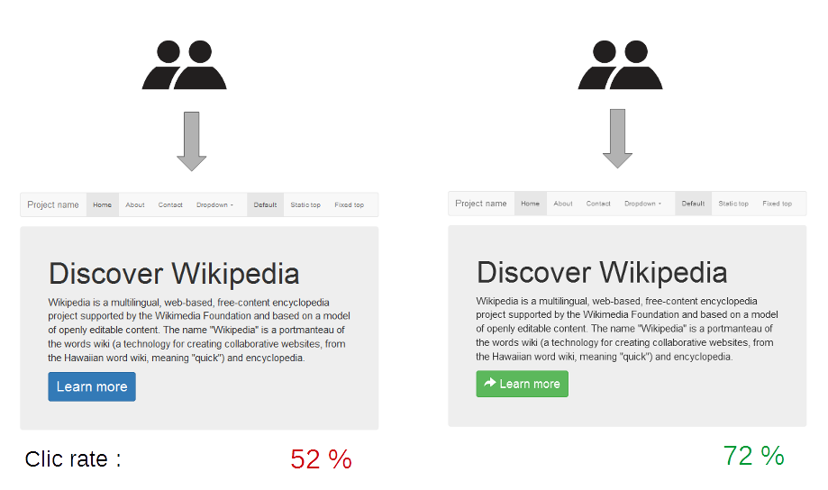
A common CRO technique is A/B testing. You create two versions of your landing page (Version A and Version B) with one small difference, like the headline text or the color of the CTA button. You then show each version to a different group of visitors and see which one performs better.
By continuously testing and refining these elements, you can create a landing page that not only looks good but also effectively turns visitors into customers.
What is the primary goal of a landing page?
Which feature is intentionally omitted from most landing pages to increase focus?
Ultimately, a landing page is a powerful tool because it respects the visitor's time and attention. By providing a clear, focused path to a valuable offer, it creates a better experience for the user and delivers better results for the business.