Japanese Candlestick Charting Essentials
Introduction to Candlestick Charts
A Story in a Single Shape
Long before computers and stock tickers, a Japanese rice trader named Munehisa Homma discovered a brilliant way to visualize price movements in the 18th century. He wasn't just tracking the price of rice; he was tracking the market's emotions. His method, now called Japanese candlestick charting, has become a cornerstone of financial analysis worldwide.
Each candlestick tells the story of a specific time period, whether it's one minute, one day, or one month. It packs four crucial pieces of information into a simple, elegant shape.
Anatomy of a Candlestick
Every candlestick is built from four data points for a given period: the price at which it opened, the highest price it reached, the lowest price it reached, and the price at which it closed. We often call this OHLC (Open, High, Low, Close).
The main, wide part of the candlestick is called the real body. It represents the range between the opening and closing prices. The thin lines extending above and below the body are the shadows, or wicks. These show the full range of price movement during the period, from the high to the low.
The color of the body tells you the direction of the price movement. A green (or white) body means the price closed higher than it opened. A red (or black) body means the price closed lower than it opened.
The size of the body also matters. A long body indicates strong buying or selling pressure, showing a significant price change from open to close. A short body suggests little price movement and can be a sign of consolidation or indecision in the market.
Reading the Shadows
The shadows provide valuable clues about the battle between buyers and sellers.
A long upper shadow suggests that buyers tried to push the price up, but sellers took control and forced it back down before the period closed. It shows that the high of the period was not sustainable.
A long lower shadow tells the opposite story. Sellers pushed the price down, but buyers stepped in and drove it back up. This indicates buying support at lower prices.
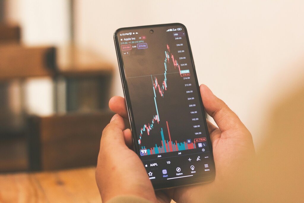
Candles with short shadows indicate that most of the trading action was confined near the open and close. When you see a candle with long shadows and a small body, it signals a lot of volatility but little resolution between buyers and sellers. It's a sign of a tug-of-war.
By learning to read these simple shapes, you can gain a quick visual sense of market sentiment and price action. Let's review what you've learned.
Who is credited with inventing the candlestick charting method in the 18th century for tracking the rice market?
The wide part of a candlestick, known as the 'real body', represents the range between the period's highest and lowest prices.
Understanding these individual components is the first step. Soon, you'll see how they combine to form patterns that tell a much larger story.