Introduction to Web Development
Introduction to HTML and CSS
The Blueprint of the Web
Every website you visit is built on a foundation of HTML, which stands for HyperText Markup Language. Think of it as the skeleton of a webpage. It provides the essential structure and organizes the content, but it doesn't handle any of the visual styling.
Just like a house has a frame, walls, and a roof, an HTML document has a standard structure that browsers understand. It all starts with a document type declaration, followed by the <html> element which wraps everything else.
<!DOCTYPE html>
<html>
  <head>
    <!-- Meta-information goes here -->
    <title>My First Webpage</title>
  </head>
  <body>
    <!-- Visible content goes here -->
  </body>
</html>
The <head> section contains information about the page, like the title that appears in your browser tab. The <body> is where all the visible content lives—the text, images, and links you interact with.
Within the body, we use different elements, or tags, to structure the content. The most common are headings and paragraphs.
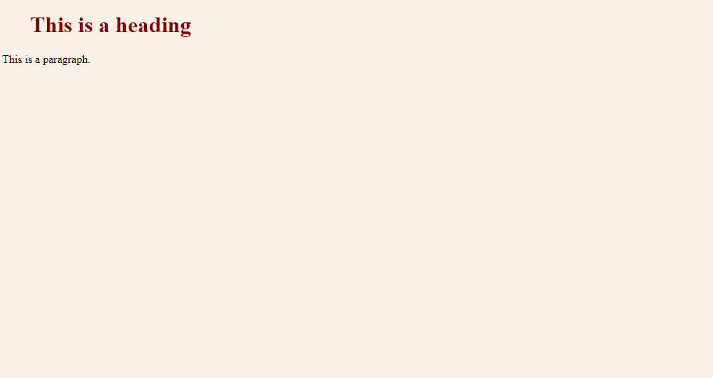
<h1>This is a heading</h1>
<p>This is a paragraph.</p>
Headings range from <h1> (the most important) to <h6> (the least important). Paragraphs are created with the <p> tag. When a browser reads this HTML, it renders it as structured text.
Meaningful Structure
You could build an entire website using just <div> tags for every section, but that would be like building a house where every room is just called "room." It's not very descriptive. This is why we use semantic HTML.
Semantic elements are HTML tags that clearly describe their meaning to both the browser and the developer. For example, instead of <div id="header">, we can just use <header>. This makes the code easier to read and maintain.
Using semantic tags helps search engines, screen readers for the visually impaired, and other developers understand the structure of your content.
Common semantic elements create a clear and logical page layout.
This structure provides a clear hierarchy. The <header> holds introductory content, <nav> contains navigation links, <main> is for the primary content, and <footer> contains information like contact details or copyrights.
Adding Style with CSS
HTML provides the structure, but CSS (Cascading Style Sheets) provides the style. It's the language we use to control the colors, fonts, spacing, and layout of our webpages. If HTML is the skeleton, CSS is the clothing and paint.
CSS works by selecting HTML elements and applying rules to them. A rule consists of a selector and a declaration block. The selector points to the HTML element you want to style, and the declaration block contains one or more property-value pairs.
/* This is a CSS comment */
p {
  color: blue;
  font-size: 16px;
}
In this example, p is the selector. It targets all <p> (paragraph) elements. The declarations inside the curly braces set the text color to blue and the font size to 16 pixels.
Selectors can target elements by their tag name (like p), a class name (like .featured-article), or an ID (like #main-logo).
One of the most fundamental concepts in CSS is the box model. Every element on a page is essentially a rectangular box. This box has four parts.
| Part | Description |
|---|---|
| Content | The actual text or image. |
| Padding | The transparent space around the content. |
| Border | A line that goes around the padding and content. |
| Margin | The transparent space around the border, separating it from other elements. |
Understanding how to manipulate the margin, border, and padding of these boxes is key to controlling the layout of your page.
Modern Layouts
For a long time, creating complex page layouts in CSS was difficult. Modern CSS has introduced two powerful layout systems that make it much easier: Flexbox and Grid.
Flexbox is designed for one-dimensional layouts—either a row or a column. It excels at distributing space among items in a container and aligning them. It's perfect for navigation bars, component galleries, and centering things vertically.
Use Flexbox when you need to align a series of items in a single line (or a wrapped line).
Grid is designed for two-dimensional layouts, managing both rows and columns at the same time. This makes it ideal for creating the overall layout of a webpage, like the semantic structure we saw earlier. You can define a grid and place items precisely where you want them.
Finally, it's crucial that websites work well on all devices, from large desktop monitors to small phone screens. This is called responsive design.
The main technique for responsive design is using media queries. A media query allows you to apply different CSS rules based on the characteristics of the device, most commonly the width of the screen.
/* Base styles for the body */
body {
  font-size: 16px;
}

/* Media query for screens smaller than 600px */
@media (max-width: 600px) {
  body {
    font-size: 14px; /* Make font smaller on small screens */
  }
}
By combining flexible layouts like Flexbox or Grid with media queries, you can create a seamless experience for every user, no matter how they access your site.
What is the primary purpose of the <head> section in an HTML document?
Why is using semantic HTML elements like <header>, <nav>, and <main> generally better than using <div> elements for everything?
With HTML for structure and CSS for style, you have the two core technologies needed to build for the web. They are the essential starting point for any web development journey.