Introduction to Frontend Development
HTML and CSS Basics
Structuring the Web with HTML
Every website you visit is built on a foundation called HTML, which stands for HyperText Markup Language. Think of it as the skeleton of a webpage. It provides the basic structure and organizes all the content, like text, images, and links.
HTML to define the content of web pages
HTML works using a system of elements, which you create with tags. Most tags come in pairs: an opening tag like <h1> and a closing tag like </h1>. Everything between these tags is the content of that element.
Some elements also have attributes, which provide extra information. For example, an image tag needs an attribute to tell the browser where to find the image file.
<!DOCTYPE html>
<html>
<head>
  <title>My First Page</title>
</head>
<body>

  <h1>Welcome to my website!</h1>
  <p>This is a paragraph of text.</p>
  <a href="https://www.example.com">This is a link</a>
  <img src="image.jpg" alt="A descriptive caption">

</body>
</html>
In that example, <h1> is a heading, <p> is a paragraph, <a> is a link, and <img> is an image. The <a> tag has an href attribute for the link's destination, and the <img> tag has src (source) and alt (alternative text) attributes.
Semantic Markup and Forms
Modern HTML encourages using tags that describe the meaning of the content, not just how it looks. This is called semantic markup. Using tags like <header>, <footer>, <nav>, and <article> tells browsers, search engines, and screen readers exactly what each part of your page is for. It makes your site more accessible and easier to find.
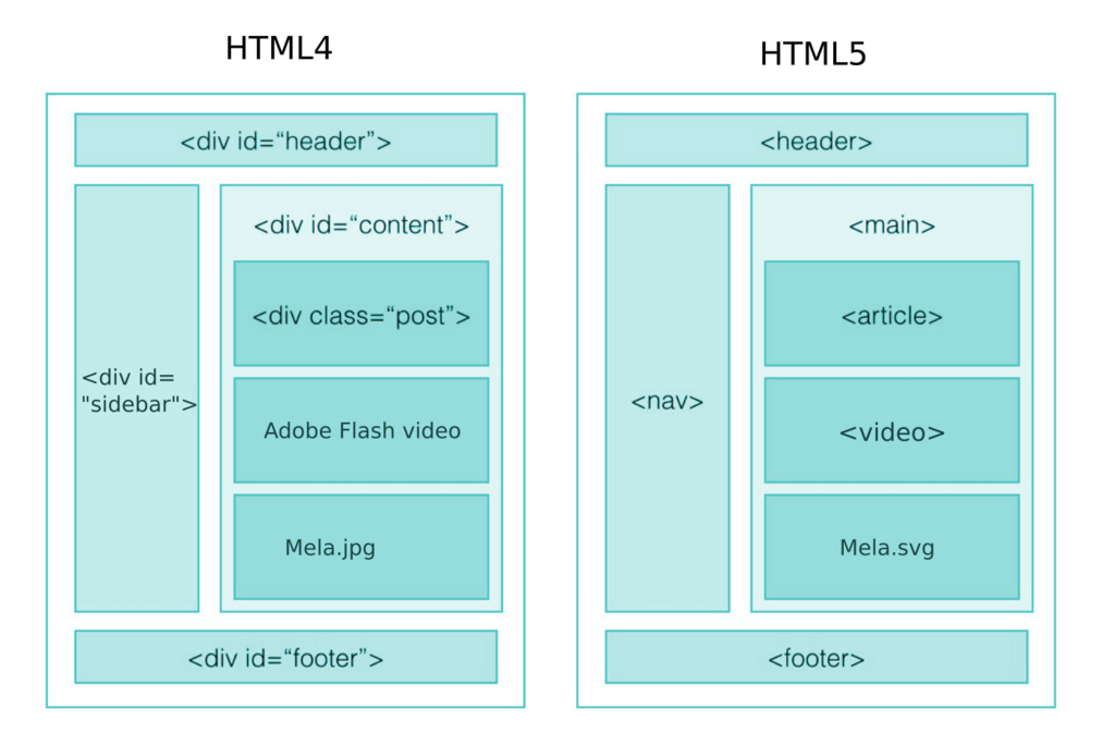
Forms are another key part of HTML, allowing users to input information. You create them using the <form> element, which can contain various input types.
<form>
  <label for="email">Email:</label><br>
  <input type="email" id="email" name="email"><br>

  <label for="password">Password:</label><br>
  <input type="password" id="password" name="password"><br><br>

  <button type="submit">Log In</button>
</form>
Here, <label> provides a description for the <input> field, creating a more user-friendly experience. The type attribute on the input element specifies what kind of data is expected.
Styling with CSS
While HTML provides the structure, Cascading Style Sheets (CSS) brings it to life with style. If HTML is the skeleton, CSS is the clothing, hair, and eye color. It controls everything from fonts and colors to the layout of elements on the page.
CSS describes how HTML elements should be displayed.
CSS works by selecting an HTML element and then applying a set of styling rules. A rule consists of a selector (which element to target) and a declaration block containing properties and values.
/* This is a CSS comment */

p {
  color: navy;
  font-size: 16px;
}

.highlight {
  background-color: yellow;
}

#main-header {
  border-bottom: 2px solid black;
}
In this snippet:
pis an element selector. It styles all<p>tags..highlightis a class selector. It styles any element withclass="highlight".#main-headeris an ID selector. It styles the one element withid="main-header".
The Box Model and Layout
Every element on a webpage is a rectangular box. The CSS box model is the rulebook that defines how this box is sized and spaced. It consists of four parts, from the inside out: the content, padding, border, and margin.
| Part | Description |
|---|---|
| Content | The actual text, image, or other media. |
| Padding | The transparent space between the content and border. |
| Border | A line that goes around the padding and content. |
| Margin | The transparent space outside the border, separating it from other elements. |
Understanding the box model is crucial for positioning elements. By adjusting margin and padding, you control the spacing between elements. You can also use the position property in CSS for more complex layouts.
Finally, a key concept in modern web design is making sites that work on any screen size, from phones to desktops. This is called responsive design. A simple way to achieve this is using percentages for widths instead of fixed pixels and using media queries to apply different styles for different screen sizes.
/* Basic responsive rule */
.container {
  width: 90%; /* Use percentage for fluidity */
  max-width: 1200px; /* Set a max size for large screens */
}

/* Media query for smaller screens */
@media (max-width: 600px) {
  body {
    font-size: 14px; /* Make font smaller on mobile */
  }
}
Let's review what we've covered.
Now, test your knowledge.
What is the primary purpose of HTML (HyperText Markup Language)?
In the HTML code <img src="image.jpg" alt="A descriptive caption">, the src and alt parts are known as ________.
HTML and CSS are the essential building blocks of the web. By mastering how to structure content and apply visual styles, you have the power to create your own corner of the internet.