Introduction to Design Principles
Introduction to Design Principles
The Building Blocks of Good Design
Have you ever looked at a poster, a website, or a room and thought, "Wow, that just works"? That feeling of rightness isn't an accident. It's the result of design principles. These aren't strict rules, but rather guidelines that help arrange elements in a way that is effective and pleasing to the eye. Think of them as the grammar of a visual language. Once you understand them, you start to see them everywhere, and you gain the power to create more compelling visuals yourself.
Balance Creates Stability
Balance is about distributing the visual weight of objects, colors, texture, and space. If a design was a physical object, balance is what would keep it from tipping over. A balanced design feels stable and calm.
There are three main types of balance:
- Symmetrical: The elements on one side of the design are a mirror image of the other side. This creates a formal, orderly look. Think of the human face or the front of a classical building.
- Asymmetrical: The two sides are not identical, but the elements are arranged to have a similar visual weight. A large, simple shape might be balanced by a smaller, more complex one. Asymmetrical balance often feels more dynamic and modern.
- Radial: Elements are arranged around a central point. Think of a spiral staircase, a bicycle wheel, or a sunflower. This type of balance can draw the eye to the center.
Contrast and Emphasis
Contrast is what we use to make things stand out. It’s created when two elements are different. This could be a difference in color (light vs. dark), size (large vs. small), or texture (smooth vs. rough). Without contrast, a design can feel flat and uninteresting. It’s a key tool for grabbing attention and organizing information.
Closely related to contrast is emphasis. Emphasis is about creating a focal point—a primary area of interest that catches the viewer’s eye. You use contrast to create emphasis. By making one element bigger, bolder, or a different color, you’re telling the viewer, “Look here first.” A design without a clear point of emphasis can be confusing.
A good rule of thumb: If everything is emphasized, nothing is emphasized.
Movement and Proportion
Movement is the path the viewer’s eye takes through the design. A strong design guides the viewer from one element to another in an intentional sequence. This can be achieved using lines, edges, shapes, and color. The goal is to control the flow of information and tell a story, leading the viewer to the most important elements.
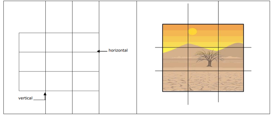
Proportion refers to the relative size and scale of the various elements in a design. It's about the relationship between objects, or parts of a whole. When the proportion is harmonious, the design feels right. When it's off, the design can feel unsettling or awkward. The rule of thirds, a popular guideline in photography and art, is a great example of using proportion to create a more dynamic and interesting composition.
Repetition and Unity
Repetition is the act of reusing the same or similar elements throughout your design. This could be a color, a font, a shape, or a pattern. Repetition helps to strengthen a design by tying together individual elements. It creates a sense of association and consistency that makes the design feel cohesive.
When all the principles come together, you achieve unity. Unity is the feeling that all the parts of your design belong together and form a coherent whole. A unified design is one where the elements are in agreement, creating a sense of completeness. Every piece looks like it's in the right place, contributing to the overall message. It’s the ultimate goal of any design.
Now, let's test your understanding of these core principles.
A poster design features a large, dark photograph on the left side, balanced by several smaller blocks of bright text on the right. The composition feels stable but is not a mirror image. Which principle of balance does this describe?
True or False: The primary goal of achieving 'Unity' in a design is to ensure that every individual element stands out as much as possible.
Understanding these principles gives you a framework for both creating and critiquing visual work. They are the foundation upon which all good design is built.