Intermediate Trading Strategy and Execution
Advanced Charting Techniques
Seeing the Bigger Picture
Professional traders don't look at a single chart in isolation. They analyse the market across multiple timeframes to build a complete picture. Think of it like using a satellite map. The weekly or daily chart is your 10,000-foot view, showing the major highways and mountain ranges—the long-term structural trend. The 4-hour or 1-hour chart is your city-level view, revealing the main roads and districts. The 15-minute chart is your street view, showing the short-term noise and immediate traffic.
By aligning your trades with the dominant trend seen on higher timeframes, you're swimming with the current, not against it. This is the core of multi-timeframe analysis.
This top-down approach gives you context. A bullish pattern on a 15-minute chart is far more reliable if the daily and 4-hour charts are also in a clear uptrend. You're looking for confirmation across the timeframes. A common professional approach is the which helps traders align their actions with the market's broader intentions. This method prevents you from getting caught in minor fluctuations that go against the primary market direction.
The Language of Patterns
Once you have your timeframe context, you can start looking for specific chart patterns. These formations are the market's body language, telling a story about the battle between buyers and sellers. They tend to form near significant price levels, often revealing the footprint of as they accumulate or distribute positions.
The most reliable patterns fall into two categories: reversals and continuations.
The Head and Shoulders is a classic reversal pattern that signals a potential end to an uptrend. It forms with a peak (left shoulder), followed by a higher peak (head), and then a lower peak (right shoulder). A trendline, known as the neckline, is drawn connecting the lows between the peaks. A decisive break below this neckline is the signal to a potential sell-off.
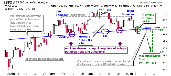
Its bullish counterpart is the Inverse Head and Shoulders, which is simply the same pattern flipped upside down, signalling a potential bottom.
Double Tops and Bottoms are simpler but equally powerful. A Double Top looks like the letter 'M' and occurs when an asset's price hits a resistance level twice without breaking through. It signals that buyers are losing momentum. A Double Bottom resembles a 'W', where the price finds support at the same level twice, suggesting that sellers are exhausted and a rally may be imminent.
Continuation patterns, on the other hand, signal a pause in the prevailing trend, not a reversal. A Flag pattern is a classic example. It appears after a strong, sharp price move (the 'flagpole'), followed by a short period of consolidation in a narrow, rectangular range that drifts slightly against the trend. A breakout from this rectangle in the direction of the original trend signals that the next leg of the move is likely underway.
Confirming with Volume and Averages
A pattern on its own is just a shape. To increase its reliability, you need confirmation. One of the most powerful confirmation tools is a moving average ribbon. Instead of using a single moving average, a ribbon combines several of them to provide a richer view of the trend's health, direction, and momentum.
We will focus on a common setup using four Exponential Moving Averages (EMAs): the 9, 20, 50, and 200 periods.
| EMA | Timeframe | Interpretation |
|---|---|---|
| 9-EMA | Short-term | Tracks immediate price momentum. |
| 20-EMA | Short-term | A key level for pullbacks in a healthy trend. |
| 50-EMA | Medium-term | Represents the intermediate trend direction. |
| 200-EMA | Long-term | The institutional benchmark; defines the long-term bull/bear market. |
When these EMAs are stacked in numerical order (9 above 20, 20 above 50, etc.) and are fanning out, it indicates a strong, healthy uptrend. The opposite configuration signals a strong downtrend. The ribbon acts as a dynamic zone of support and resistance. In an uptrend, pullbacks to the area between the 9 and 20-EMAs are often buying opportunities. A price break below the 50-EMA is a warning sign that the intermediate trend might be changing.
Combine Multiple Technical Analysis Tools: Utilize a combination of chart patterns, trendlines, support, and resistance levels, moving averages, and oscillators to enhance the accuracy of your market analysis and trading decisions.
Volume is another critical piece of the puzzle. A breakout from a chart pattern on high volume is much more significant than one on low volume. High volume shows conviction and participation. For example, in a Head and Shoulders pattern, you want to see volume diminish as the right shoulder forms, and then surge as the price breaks the neckline. This tells you that the selling pressure is real and significant.
What is the primary benefit of using a multi-timeframe analysis in trading?
A chart pattern forms with a peak, followed by a higher peak, and then a lower peak. A break below the trendline connecting the lows of this formation typically signals a market top. What is this pattern called?
Mastering these techniques takes practice. The goal is to train your eyes to see these structures as they form, allowing you to anticipate potential moves before they happen. Using charting software like TradingView, you can draw trendlines, mark patterns, and apply your EMA ribbon to bring this analysis to life on any chart.