Infographic Design Essentials
Introduction to Infographics
What Are Infographics?
An infographic is a visual representation of information, data, or knowledge. The goal is simple: to present complex topics in a way that’s quick and easy to understand. By combining images, charts, and minimal text, infographics transform dense material into something engaging and digestible.

Think of them as visual stories. Instead of reading a long article about population growth, you might see an infographic that uses maps, charts, and icons to show the same information in seconds. They grab your attention and make the key takeaways stick in your mind.
A Brief History
While the term "infographic" feels modern, the idea of explaining things visually is ancient. Early cave paintings that told stories of hunts could be considered the first infographics. Later, maps were created to simplify the complex geography of the world.
However, the data-driven infographics we know today have their roots in the late 18th century. A political economist named William Playfair is credited with inventing the line graph, bar chart, and pie chart. He wanted to make economic data less abstract and more intuitive for people to grasp.
Another key figure was Florence Nightingale. During the Crimean War in the 1850s, she used a unique chart, often called a "Coxcomb," to show that more soldiers were dying from poor sanitation in hospitals than from battle wounds. Her powerful visual convinced Queen Victoria and government officials to improve hospital conditions, saving countless lives.
In the digital age, the internet and social media have caused an explosion in the creation and sharing of infographics. With so much information competing for our attention, a good infographic can cut through the noise.
Common Types
Infographics come in many shapes and sizes, each suited for different kinds of information. Here are a few common formats.
Statistical infographics are all about the numbers. They use charts, graphs, and icons to visualize data from surveys, reports, or research. The main goal is to make statistics compelling and easy to compare.
Informational infographics explain a concept or provide an overview of a topic. They often use a mix of text, icons, and images to break down information into sections. Think of them as a visual guide or a cheat sheet.
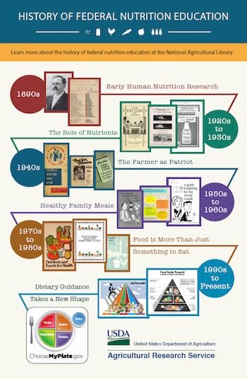
Timeline infographics show events in chronological order. They're perfect for telling the story of a company, explaining a historical event, or outlining the steps in a long process. The visual flow helps viewers understand the sequence and duration of events.
Process infographics illustrate the steps in a process. They use flowcharts or sequential diagrams to guide the reader from start to finish, making complex workflows clear and simple to follow.
Why They Matter
In a world of information overload, infographics are powerful communication tools. Our brains process visuals much faster than text, which is why a well-designed infographic can convey a message almost instantly. This makes them incredibly effective for grabbing attention and making information memorable.
They distill complex information into clear, digestible content, providing a comprehensive and engaging visual deep dive of your material.
They are used in almost every field. Marketers use them to showcase product benefits, educators use them to simplify complex subjects for students, and journalists use them to explain news stories with data. They help audiences understand key information, which leads to better decision-making and knowledge retention.
Ready to check your understanding?
What is the primary goal of an infographic?
Which historical figure used a chart, known as a 'Coxcomb,' to convince officials to improve hospital sanitation during the Crimean War?
Infographics are more than just pretty pictures; they are a bridge between raw data and human understanding.