Immunohistochemistry and Histopathology Infographics
Pathology Visual Hierarchy
Guiding the Eye in Pathology
A stained tissue slide contains a vast amount of information. But raw data isn't a diagnosis. To be useful, that data must be presented as a clear visual narrative. Visual hierarchy is the practice of arranging elements to guide a viewer’s eye through that narrative, ensuring the most critical information is seen first. It transforms a complex image into an instantly interpretable story, which is crucial when communicating findings to colleagues, clinicians, or patients.
By arranging visual elements with intent, you control the story. You decide what the viewer sees first, second, and third, moving their attention from the primary diagnostic finding to the supporting evidence.
How We Read Images
People don't scan images randomly. Our eyes follow predictable paths honed by years of reading text and navigating digital interfaces. Two of the most common paths are the F-pattern and the Z-pattern. Understanding these helps us design more effective clinical reports and research presentations.
The is common in text-heavy layouts. A viewer scans horizontally across the top, then moves down the left side, and makes a second horizontal scan, forming a rough 'F' shape. This is often seen in split-view applications, where a list of slides or patient data is on the left and the main image viewer is on the right. The viewer's attention naturally starts at the top-left, moves to the image, and may return to the left-side information as needed.
The Z-pattern applies to more balanced, graphical layouts. The eye moves from top-left to top-right, then sweeps diagonally down to the bottom-left, and finally moves across to the bottom-right. A poster or a summary graphic in a publication is a perfect candidate for a Z-pattern layout. The most important takeaway (like the final diagnosis) should be in the top-left (position 1), with supporting visuals or key markers along the top-right and bottom-left (positions 2 and 3), and concluding details like clinical implications in the bottom-right (position 4).
Creating a Focal Point
Once you know how people scan, you can use design principles to control what they see. The goal is to create a diagnostic focal point, an 'H1' for your visual data. This is the single most important finding that everything else supports.
Size: The largest element on the page will attract the most attention. In a pathology report, this might be a key microscopic image showing the defining feature of a disease, like a prominent nucleolus or a specific cell morphology.
Color and Contrast: Our eyes are drawn to contrast. A brightly stained IHC marker against a muted counterstain creates a powerful focal point. When multiple markers are used, the one with the highest clinical relevance should be given the most striking color or be presented with the highest contrast to its surroundings. This immediately tells the viewer, "Look here first."
Proximity: Placing related items close together creates a conceptual group. This is a core idea from Gestalt psychology known as the Law of Proximity. In a slide image, grouping a high-power view next to its corresponding low-power locator map helps the viewer understand the context instantly. They are perceived as a single unit of information.
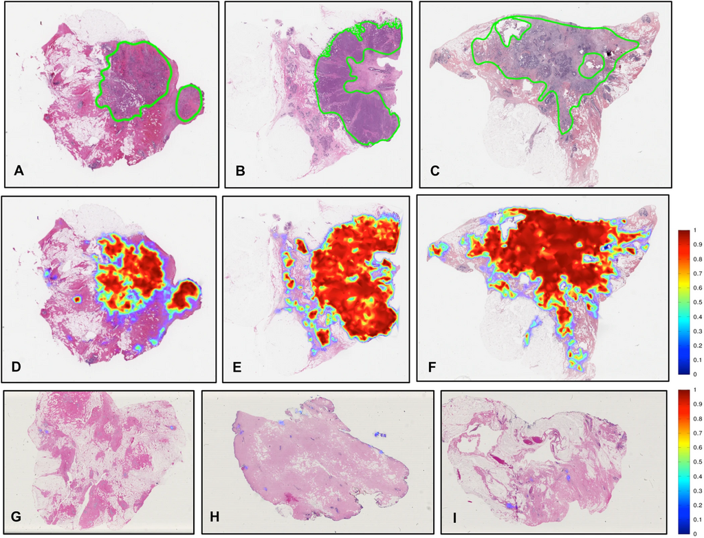
These principles work together. A large image (size) showing a brightly stained cell group (color) placed next to a concise label (proximity) creates an undeniable focal point. The viewer has no choice but to start their analysis exactly where you intended.
Building the Narrative
A well-structured visual report follows a clear hierarchy of information. This isn't just about making things pretty; it's about making them understandable with minimal cognitive effort.
-
Primary Finding (The 'What'): This is your focal point. It should be the first thing a person sees and understands. It could be a title like "High-Grade Serous Carcinoma" or an image that unequivocally shows the diagnosis.
-
Supporting Evidence (The 'Why'): These are the secondary elements. They prove the primary finding. This includes magnified views of cellular atypia, IHC staining results showing specific protein expression (e.g., p53 mutation pattern), or graphs of quantitative data. Use principles like proximity to group evidence with the finding it supports.
-
Context and Implications (The 'So What'): This is the tertiary information. It provides context, such as patient history, or outlines the next steps, like recommended genetic testing or treatment options. This information should be placed 'lower' in the visual hierarchy, often at the bottom or sides of a layout, where the eye travels last.
By layering information this way, from the general conclusion to the specific evidence, you guide your audience through your diagnostic reasoning process. This makes the information not just accurate, but persuasive and immediately useful to a diverse team of specialists.
Visual elements in an information presentation are often spatially and semantically grouped hierarchically for effective message delivery.
Applying these principles ensures that your visual communications are as rigorous as your science. It makes complex data accessible, reduces the chance of misinterpretation, and allows your key findings to stand out with clarity and impact.