HTML Sonic Clone Game
HTML and CSS Basics
The Blueprint of the Web
Every webpage you visit, from a simple blog to a complex application, is built on a foundation of HTML. Think of HTML (HyperText Markup Language) as the skeleton of a webpage. It provides the basic structure and organizes the content.
HTML works using a system of tags. Most tags come in pairs: an opening tag and a closing tag. For example, to create a paragraph, you wrap your text in <p> and </p> tags. The tags and the content between them form an element.
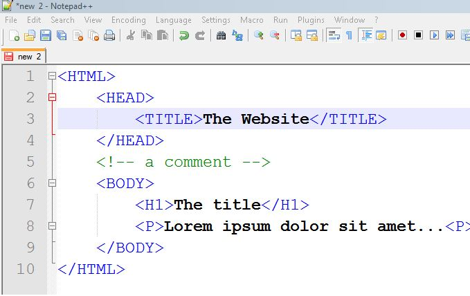
A typical HTML document has a standard structure that tells the browser how to read it. It starts with <!DOCTYPE html> to declare it's an HTML document, followed by the <html> element, which wraps everything else. Inside, you'll find a <head> for metadata (like the page title) and a <body> for all the visible content.
<!DOCTYPE html>
<html>
<head>
  <title>My First Webpage</title>
</head>
<body>

  <h1>This is a main heading</h1>
  <p>This is a paragraph of text.</p>
  <div>This is a container.</div>

</body>
</html>
Here are a few essential tags:
<h1>to<h6>: Headings, with<h1>being the most important.<p>: Paragraphs for regular text.<div>: A generic container used to group elements for styling or layout purposes.
Adding Style and Color
While HTML provides the structure, it doesn't do much for visual appeal. That's where CSS (Cascading Style Sheets) comes in. If HTML is the skeleton, CSS is the clothing, hair, and makeup. It controls the colors, fonts, spacing, and overall look of your content.
CSS works by selecting an HTML element and then applying a set of style rules to it. The basic syntax looks like this:
selector {
  property: value;
}
The selector points to the HTML element you want to style. The property is the style attribute you want to change, like color or font-size, and the value is the setting you want to apply.
For example, to make all paragraph text red, you would write:
p { color: red; }.
You can write CSS directly in your HTML file, but it's best practice to keep it in a separate file (e.g., style.css). You then link this stylesheet to your HTML document using a <link> tag in the <head> section.
<head>
  <title>My Styled Page</title>
  <link rel="stylesheet" href="style.css">
</head>
To style specific elements, you can give them a class or id attribute in the HTML. In your CSS, you target a class with a period (.) and an ID with a hash (#). Classes can be reused on multiple elements, while an ID must be unique to a single element on the page.
| Selector | Example | Description |
|---|---|---|
| Element | p | Selects all <p> elements. |
| Class | .highlight | Selects all elements with class="highlight". |
| ID | #header | Selects the element with id="header". |
Styling Text and Layouts
With selectors, you can control almost any visual aspect of an element. For text, common properties include font-family, font-size, font-weight (for bolding), and text-align.
/* Example CSS for text styling */
body {
  font-family: Arial, sans-serif;
}

.title-text {
  font-size: 24px;
  font-weight: bold;
  color: #333;
}

.centered {
  text-align: center;
}
For layout, a fundamental concept is the CSS box model. Every HTML element can be seen as a box with four parts: the content itself, padding, a border, and a margin. These parts work together to create space around and within elements.
- Padding is the space inside the border, between the border and the content.
- Border is a line that goes around the padding and content.
- Margin is the space outside the border, clearing an area around the element.
Making it Responsive
Today, people browse the web on everything from tiny phones to massive monitors. A website that looks good on a desktop might be unusable on a mobile device. Responsive design is the practice of making your web pages look good on all screen sizes.
CSS provides a powerful tool for this called media queries. A media query allows you to apply a block of CSS styles only when certain conditions are met, such as the screen being wider or narrower than a specific width.
This lets you change layouts, resize text, or hide elements to better fit the device's screen.
/* Base styles for all devices */
.container {
  width: 90%;
  margin: 0 auto;
}

/* Styles for screens 768px and wider */
@media (min-width: 768px) {
  .container {
    width: 80%;
    max-width: 960px;
  }

  h1 {
    font-size: 3em;
  }
}
In the example above, the .container has a width of 90% by default. But on screens that are at least 768 pixels wide, the media query activates, changing the container's width to 80% and increasing the <h1> font size. This simple technique is the core of building responsive websites.
With a solid grasp of HTML for structure and CSS for styling, you have the fundamental building blocks for creating any webpage or application interface. Let's review some of the key terms we've covered.
Ready to check your understanding?
What is the primary role of HTML in web development?
In a CSS file, which character is used as a selector for an element's id?
Now you know the basics of how to structure a webpage with HTML and make it look good with CSS. These are the first essential skills for any web developer.