Heikin Ashi Candlestick Analysis
Introduction to Heikin Ashi
Seeing the Forest for the Trees
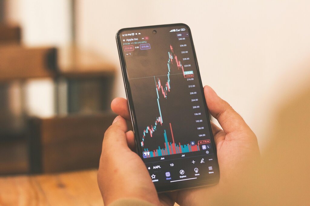
Traditional candlestick charts are powerful, but they can be noisy. The constant flickering between red and green candles can make it difficult to see the underlying trend. It’s like trying to judge the direction of a river by watching every single ripple on the surface. You see a lot of movement, but what's the overall flow?
What if there was a way to smooth out those ripples? A charting technique from 18th-century Japan offers a solution. It was developed by Munehisa Homma, a legendary rice trader who became a financial advisor to the Japanese government. The method is called Heikin Ashi.
average bar
The name perfectly describes what it does. Instead of plotting the raw open, high, low, and close prices for a period, Heikin Ashi charts use a modified formula that averages price data. This creates a new set of candles that filter out the market noise, revealing a clearer picture of the trend.
A Tale of Two Charts
Let's compare the two. A regular candlestick chart shows the exact price action within a period. A green candle means the price closed higher than it opened. A red candle means it closed lower. Simple enough, but in a choppy market, you'll often see a mix of red and green candles even when the price is generally moving in one direction.
Heikin Ashi charts look different. Because they average the data, they produce smoother, more consistent candles. Instead of a messy mix of colors, a strong uptrend will appear as a series of solid green candles with small or no lower wicks. A strong downtrend will be a series of solid red candles with small or no upper wicks. Periods of consolidation or potential reversal are marked by candles with small bodies and wicks on both sides.
The main benefit is clarity. By smoothing price action, Heikin Ashi makes trends easier to identify and follow. Traders can stay in a profitable trend longer because the chart isn't giving as many false signals of a reversal.
Heikin Ashi's strength is its ability to highlight the direction of a trend, reducing the distraction of minor corrections.
However, there's a trade-off. Because Heikin Ashi charts average the price, they don't show the exact open and close prices for a given period. This means the prices on a Heikin Ashi chart might differ from the actual market prices. For this reason, many traders use Heikin Ashi charts alongside standard candlestick charts, getting the clarity of one and the precise price data of the other.
Ultimately, Heikin Ashi is a tool for perspective. It helps you step back from the candle-to-candle noise and focus on the bigger story the market is telling.
What is the primary purpose of using Heikin Ashi charts compared to traditional candlestick charts?
On a Heikin Ashi chart, what does a series of solid green candles with small or no lower wicks typically indicate?