Graphic Design Principles Applied
Advanced Composition Strategies
Beyond the Basics of Layout
You've mastered basic alignment and know your way around a simple column grid. But professional layout isn't just about tidiness; it's about psychology. Advanced composition uses structure to guide the viewer's eye, control the flow of information, and evoke a specific feeling. It’s the difference between a list of facts and a compelling visual story.
We'll move past simple organization and explore how designers use structural systems to manage complexity and create visual narratives. This involves a deeper understanding of human perception, leveraging not just to group items, but to build sophisticated information hierarchies.
Structuring Complex Information
When you're designing a data-heavy dashboard, a magazine spread, or a complex website, a simple 12-column grid might not be enough. This is where more robust systems come into play, like modular grids and baseline grids.
A modular grid is a system of columns and rows that intersect to create small, repeatable units called modules. Instead of just aligning items horizontally, you can align them in two dimensions. This creates a more cohesive, rhythmic structure that can handle a high density of content without feeling chaotic. Think of it as graph paper for your design.
A baseline grid adds another layer of harmony. It's an invisible set of horizontal lines that dictates where the baseline of your text should sit. By ensuring all text across different columns and sections aligns to this shared rhythm, you create a subtle but powerful sense of order and calm, making the entire layout easier to read.
Breaking the Grid for Impact
Once you've established a strong structural system, you earn the right to break it. Intentionally breaking the grid is a professional technique used to create emphasis, add energy, and draw the eye to a specific focal point. It’s a deliberate disruption of the pattern you’ve created.
Think of it like a guitar solo in a song. The song has a consistent rhythm and chord progression (the grid). The solo departs from this structure, grabbing your attention before resolving back into the main rhythm. A design element that overlaps a module, bleeds off the page, or sits at an odd angle can have the same effect. It's a calculated risk that, when done well, adds dynamism and personality.
To avoid mechanical feelings caused by grids apply “breaking rules” techniques choosing 1-2 key element to overstep grid boundaries or through irregular white spaces break strict alignments but keep breakage areas within 15% of total layout maintaining overall orderliness.
The key is intentionality. Breaking the grid without a clear purpose just looks like a mistake. But using it to emphasize a call-to-action button, a key photograph, or a powerful quote transforms a simple layout into a memorable one.
Perceived Balance and Natural Harmony
Perfect mathematical symmetry can feel sterile and boring. Professional designers often rely on optical weight and visual balance instead. Optical weight isn't about an object's actual size or mass; it's about its ability to attract the eye. Dark colors, complex textures, and isolated elements have more optical weight than light colors or simple shapes.
Achieving visual balance means arranging elements of varying optical weights so that the composition feels stable, even if it's asymmetrical. A large area of light color can be balanced by a small, dark, and complex element on the other side of the page. This creates a more dynamic and interesting tension than perfect symmetry ever could.
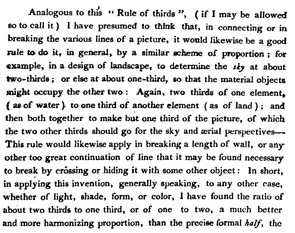
This principle is baked into classical composition rules like the and the golden ratio. The rule of thirds suggests placing key elements along lines that divide your composition into thirds, or at their intersections. This simple heuristic helps create more tension and energy than centering the subject.
The golden ratio, approximately 1:1.618, is a mathematical relationship found throughout nature that the human eye finds inherently pleasing. Applying it to layout, whether for spacing, typography, or content blocks, can create a natural sense of harmony and proportion. Many modern UI and UX designers use these principles to organize interfaces, ensuring that buttons, images, and text fields are arranged in a way that feels natural and intuitive to navigate.
What is the primary function of a baseline grid in a layout?
A designer intentionally makes a photograph overlap two columns in an otherwise strict grid layout. What is the most likely purpose of this technique?
By moving beyond simple alignment and embracing these advanced strategies, you can create layouts that are not only organized but also emotionally resonant and highly effective at communicating their message.