Graphic Design Practical Application
Advanced Visual Hierarchy
Directing the Viewer's Eye
You already know that making a headline bigger than the body text creates hierarchy. But in complex layouts, like a dense infographic or a website's homepage, hierarchy becomes less about a simple checklist and more about psychology. It’s about intentionally controlling where a person looks and in what order.
Our eyes don't wander randomly; they follow predictable paths. On text-heavy pages, many Western readers follow an F-Pattern. They scan the top of the page, then drop down a bit and scan another horizontal line, and finally scan the left side of the content vertically. For more visual, less dense layouts, the eye often moves in a Z-Pattern, from top-left to top-right, then diagonally to the bottom-left before scanning across to the bottom-right. Your job is to place the most critical information along these natural viewing paths.
Hierarchy is a fundamental principle in graphic design that involves arranging visual elements to guide the viewer’s attention and effectively communicate information.
Grouping and Separation
How do you tell a viewer that three separate statistics are related without drawing a box around them? You use proximity. This is a core idea from Gestalt psychology, a theory explaining how our brains instinctively group objects. When elements are placed close together, we perceive them as a single unit. This is far more elegant than using explicit dividers.
Other principles work similarly. Objects that share a color, shape, or size (similarity) feel related. Elements placed within a common background color (common region) also become a group. Mastering these principles allows you to build complex, nested information structures that feel intuitive and clean.
Just as proximity groups elements, negative space separates them. Negative space—or whitespace—isn't just what's leftover. It's a functional element that carves out structure. Generous whitespace around an element makes it feel more important and draws the eye. It reduces cognitive load by giving the viewer's brain a rest and making the relationships between content groups instantly clear. Think of it as the silence between musical notes; it’s what gives the notes themselves meaning.
Systems of Scale
While Gestalt principles help with grouping, established proportional systems can bring a sense of harmony to your layouts. You've likely heard of the Rule of Thirds and the . It’s best to think of these not as rigid rules but as flexible frameworks for composition.
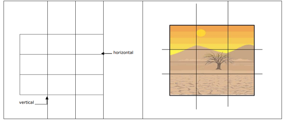
The Rule of Thirds suggests dividing your canvas into a 3x3 grid. Placing key elements along these lines or at their intersections creates a more dynamic and pleasing composition than simply centering everything. This is especially useful for balancing multiple elements in an editorial spread or on a webpage.
The Golden Ratio, often expressed as the proportion 1:1.618, provides a similar guide. You can apply it to create harmonious layout blocks, size images relative to text, or build a typographic scale where the headline, sub-headline, and body text all relate to each other by this ratio. Using these systems ensures that even in a design with many different elements, the underlying structure feels cohesive and intentional.
According to the text, what is the primary reason for a designer to understand scanning patterns like the F-Pattern and Z-Pattern?
Which Gestalt principle is used to group three separate statistics together so they are perceived as a single unit, without drawing a box around them?