Graphic Design for Professional Growth and Earning
Advanced Design Principles
Advanced Composition
You've probably heard of the rule of thirds, which is a great starting point for balanced compositions. But to create truly dynamic and sophisticated designs, we need to explore more advanced techniques. These aren't just arbitrary rules; they're based on patterns found in nature and art that humans find inherently pleasing.
One of the most famous is the Golden Ratio, a mathematical relationship approximately equal to 1.618. When applied to design, it creates a sense of harmony and natural beauty. You can use it to define the dimensions of a layout or to place key elements. A common application is the Golden Spiral, which guides the viewer's eye through the design in a fluid, organic path.
Another powerful technique is using leading lines. These are lines within your composition that draw the viewer’s eye towards a specific point of interest. They can be explicit, like a road or a fence, or implied, like the direction of a person's gaze. Using strong diagonal lines can also create a sense of movement and energy, breaking the static feeling of purely horizontal or vertical arrangements.
The Psychology of Color
Choosing colors isn't just about what looks good together. It's about communicating a message on a subconscious level. Colors have powerful psychological associations that can influence how a person feels about your design. Understanding this allows you to evoke specific emotions and drive actions.
For instance, warm colors like red and orange often convey energy, passion, and urgency. They can be great for call-to-action buttons. Cool colors like blue and green tend to feel calmer and more trustworthy, which is why they're so common in banking and healthcare branding. These associations can vary across cultures, so it's important to consider your audience.
| Color | Common Western Associations | Potential Use Cases |
|---|---|---|
| Red | Urgency, Passion, Danger, Love | Sales, call-to-actions, restaurants |
| Blue | Trust, Calm, Stability, Logic | Finance, tech, healthcare |
| Green | Nature, Growth, Health, Wealth | Environmental causes, finance |
| Yellow | Optimism, Youth, Happiness | Grabbing attention, creative brands |
| Purple | Royalty, Creativity, Luxury | High-end products, beauty brands |
Beyond individual colors, consider their interaction. Simultaneous contrast is a phenomenon where the perception of a color is affected by the color next to it. For example, a gray square will look slightly bluish when placed on a yellow background. You can use this to make colors appear more or less vibrant, creating subtle but powerful visual effects.
Typography That Speaks
Advanced typography is about making text not just readable, but expressive. The right typographic choices can set a tone, convey a personality, and enhance the meaning of the words themselves. This goes far beyond just picking a font.
Micro-typography focuses on the details. Kerning is the adjustment of space between specific pairs of letters (like 'A' and 'V') to create a visually consistent rhythm. Tracking adjusts the spacing across a whole word or block of text, which can be used to improve legibility or create an airy, elegant feel. Leading is the vertical space between lines of text; getting it right is crucial for long-form reading comfort.
Poor kerning can make a professional design feel amateurish, even if the viewer can't pinpoint why.
Pairing fonts is another key skill. A common strategy is to combine a serif font (with small decorative strokes on the letters) for body text with a sans-serif font (without strokes) for headlines. This creates contrast and helps establish a clear visual hierarchy. The key is to choose fonts that have a complementary mood but distinct structures.
Guiding the Eye
Visual hierarchy is the principle of arranging elements to show their order of importance. A strong hierarchy guides the viewer's eye through the content in the way you intend, from the most important element to the least. It's the silent narrator of your design.
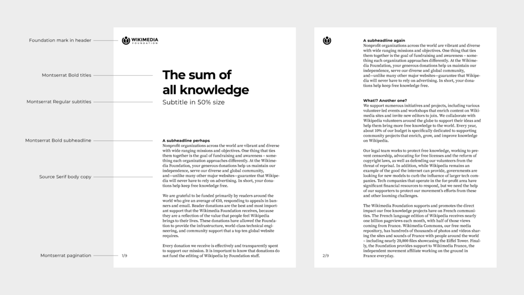
You create hierarchy using contrast in:
- Scale: Larger elements are perceived as more important.
- Color: Bright, bold colors stand out from muted or neutral ones.
- Placement: Elements placed at the top or center of a design often grab attention first.
- Whitespace: Surrounding an element with negative space makes it a focal point.
By mastering these tools, you can ensure that users see the headline first, then the sub-headline, then the body copy, and finally the call-to-action. You control the flow of information, making your design not just beautiful, but functional and effective.
Let's review these concepts before you put them to the test.
Ready to check your understanding?
What is the primary purpose of using the Golden Spiral in a design composition?
A designer places a neutral gray square on a bright yellow background. The gray square appears to have a slight bluish tint. This visual effect is an example of:
Applying these advanced principles will elevate your work from simply competent to truly compelling. They allow you to add layers of meaning and intention to your designs, creating visuals that communicate effectively and resonate deeply with your audience.