Graphic Design and Animation for Storytelling
Graphic Design Principles
The Building Blocks of Design
Good design doesn't happen by accident. It's built on a foundation of principles that guide how visual elements are arranged. Think of these principles as the grammar of a visual language. They help you create compositions that are not only beautiful but also clear and effective at communicating a message.
By understanding concepts like balance, contrast, and alignment, you can transform a simple collection of text and images into a compelling story. Let's walk through six of the most fundamental principles.
Creating Visual Harmony
Some principles are all about creating a sense of order and stability. They help the viewer feel comfortable and understand the relationships between different parts of your design. Balance, proximity, and alignment are key to achieving this harmony.
Balance
noun
The distribution of the visual weight of objects, colors, texture, and space. A balanced design feels stable and complete.
Just like in physics, every element on a page has a visual weight. Large, dark, or complex elements feel heavier than small, light, or simple ones. Balance is how you distribute this weight so that no single part of the design overpowers the rest.
There are two main types of balance:
- Symmetrical Balance: Elements on one side of the composition are mirrored on the other. This creates a formal, stable, and orderly feel.
- Asymmetrical Balance: The two sides are not identical but have similar visual weight. A large element on one side might be balanced by several smaller elements on the other. This often feels more dynamic and modern.
Next up is proximity. This principle suggests that you should group related items together. When elements are close to each other, they are perceived as a single unit rather than as several unrelated ones. This helps organize information and reduces clutter.
A business card is a perfect example. The person's name, title, and company are grouped together. The contact details like phone, email, and website are in another group. This makes the information easy to scan and understand.
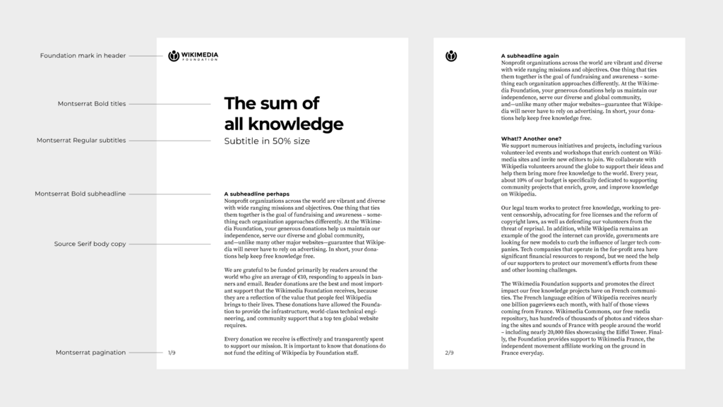
Finally, alignment brings a sense of unity and order to your design. It's about how the edges of elements line up with each other. Nothing should be placed on the page arbitrarily. Every element should have a visual connection to another element.
When items are aligned, the result is a stronger, more cohesive design. It creates a clean and intentional look. Common alignment types are left, right, and center.
Guiding the Viewer's Eye
Other principles are more about emphasis and flow. They help direct the viewer's attention to the most important parts of your design and create a consistent experience. Contrast, repetition, and space are crucial for this.
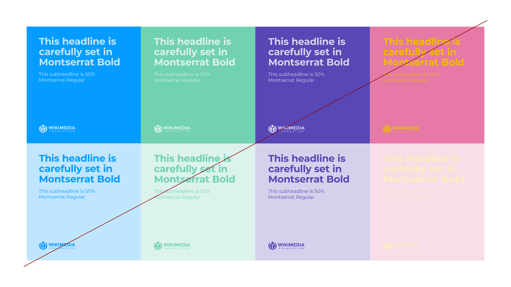
Contrast is what people notice first. It occurs when two elements are different, and it's one of the most effective ways to create emphasis and visual interest.
Contrast can be created in many ways: using light and dark colors, smooth and rough textures, large and small shapes, or modern and traditional typefaces. The key is to make the difference obvious. Weak contrast can look like a mistake.
Effective contrast makes a design more engaging and helps organize information by creating a clear hierarchy. Your eye is naturally drawn to the element with the most contrast, which should be the most important part of your message.
While contrast highlights differences, repetition is about consistency. Repeating visual elements like colors, fonts, shapes, or lines throughout a design helps to unify it and strengthen its message. It ties individual elements together and makes the design feel cohesive and intentional.
Think about a magazine. The page numbers are in the same place in every issue. Article titles use the same font. This repetition makes the content predictable and easy to navigate.
Every good graphic design leverages visual hierarchy, or the arrangement, contrast, color, and scale of elements, to imply importance.
The final principle is space, often called negative space or white space. This refers to the area around and between design elements. It's the empty space, and it's just as important as the content itself.
Space gives elements room to breathe. It can separate or group information, reduce clutter, and create a focal point. A design with plenty of negative space often feels clean, sophisticated, and easy to read. Don't be afraid of empty space; it's a powerful tool.
With these six principles in your toolkit, you have a solid framework for making thoughtful design decisions. Now, let's test your knowledge.
A poster design features a large photograph in the top-left corner, balanced by a block of text and a small logo in the bottom-right corner. This is an example of:
What is the primary purpose of using the principle of proximity in a design?
Mastering these principles will help you create visuals that are organized, clear, and effective.