Full-Stack Web Development Fundamentals
Introduction to Web Development
The Blueprint of the Web
Every website you visit is built on two core technologies: HTML and CSS. Think of them like building a house. HTML (Hypertext Markup Language) is the skeleton—it creates the structure and framework. It tells the browser what each piece of content is: a heading, a paragraph, an image, or a link.
CSS (Cascading Style Sheets) is the interior design. It takes that raw structure and makes it look good. CSS controls the colors, fonts, spacing, and layout. Without it, the web would be a very plain, black-and-white place. Together, they turn a simple document into a well-designed webpage.
HTML and CSS are the most fundamental building blocks of a webpage, and they are also your first step towards becoming a web developer.
Let's start with the foundation. Every HTML document has the same basic structure. It tells the browser, "Hey, I'm a webpage," and sets up the main containers for your content.
<!DOCTYPE html>
<html>
<head>
    <title>My First Webpage</title>
</head>
<body>
    <h1>Hello, World!</h1>
    <p>This is my very first webpage.</p>
</body>
</html>
Here's what each part does:
<!DOCTYPE html>: Declares that this is an HTML5 document.<html>: The root element that wraps everything else.<head>: Contains meta-information about the page, like the title that appears in the browser tab. This content isn't visible on the page itself.<body>: Holds all the content that you actually see on the page, like text, images, and links.
Giving Content Meaning
Inside the <body>, we use tags to define our content. These tags give the content semantic meaning. For example, <h1> tells the browser that this is the most important heading on the page, while <p> indicates a paragraph.
Using the right tags isn't just about looks; it's crucial for accessibility and search engine optimization (SEO). A screen reader uses heading tags to help a visually impaired user navigate the page, and Google uses them to understand your content's structure.
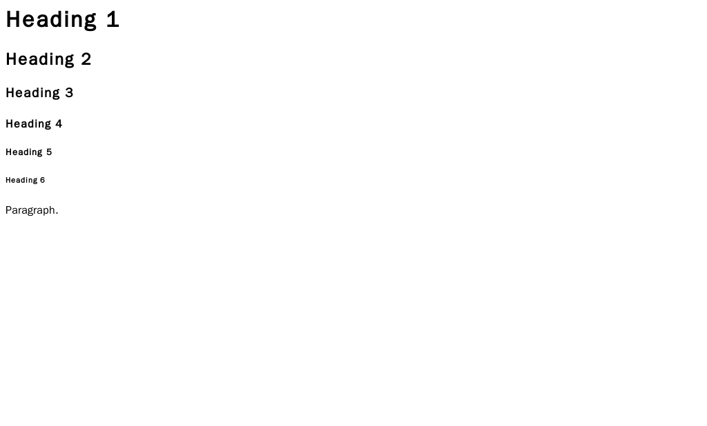
Common tags include:
<h1>through<h6>for headings.<p>for paragraphs.<a>for links, using thehrefattribute to set the destination.<img>for images, using thesrcattribute for the source file andaltfor descriptive text.<ul>,<ol>, and<li>for creating unordered (bulleted) and ordered (numbered) lists.
<body>
    <h1>An Article Title</h1>
    <p>This is the first paragraph. It introduces the main topic of the article.</p>
    <img src="image.jpg" alt="A descriptive photo">
    <p>Here's a link to <a href="https://www.example.com">another website</a>.</p>
</body>
Adding Style with CSS
Once you have your HTML structure, it's time to add style with CSS. CSS works by selecting an HTML element and applying rules to it. A rule consists of a property (like color or font-size) and a value.
/* This is a CSS comment */

h1 {
    color: blue;
    font-size: 32px;
}

p {
    line-height: 1.5;
}
In this example, the h1 selector targets all <h1> tags and makes them blue and 32 pixels tall. The p selector targets all paragraphs and increases the space between lines of text.
The best way to manage your styles is to put them in a separate .css file and link it from your HTML file's <head> section. This practice, known as separation of concerns, keeps your code clean and easy to manage.
<!-- In your index.html file -->
<head>
    <title>My Styled Page</title>
    <link rel="stylesheet" href="styles.css">
</head>
Layout and Responsive Design
Beyond colors and fonts, CSS is responsible for the entire layout of a page. Every element in HTML can be thought of as a box. The CSS box model describes how these boxes are sized and spaced. Each box consists of four parts: the content itself, padding, a border, and a margin.
Today, people browse the web on phones, tablets, and giant desktop monitors. A website that looks great on a laptop might be unusable on a phone. This is where responsive design comes in. The goal is to create a flexible layout that adapts to any screen size.
CSS provides a powerful tool for this called media queries. A media query allows you to apply specific styles only when certain conditions are met, like when the screen width is below a certain size. This lets you change font sizes, rearrange elements, or even hide things to create the best experience for every user.
/* Default styles for all screens */
.container {
    width: 960px;
    margin: 0 auto;
}

/* Styles for screens smaller than 768px */
@media (max-width: 768px) {
    .container {
        width: 100%;
    }

    h1 {
        font-size: 24px;
    }
}
With these fundamentals of HTML structure and CSS styling, you have the power to build your own static websites from scratch. Let's review the key terms.
Ready to check your understanding?
If building a website is like building a house, what role does HTML play?
Which part of an HTML document contains information like the page title that appears in the browser tab, but isn't visible on the page itself?
Learning HTML and CSS is the essential first step into the world of web development. By mastering how to structure content and how to style it, you've built a foundation for creating anything you can imagine on the web.