Full Stack Frontend Integration
Modern Layout Mastery
Architecting with CSS Grid
Forget floats and positioning hacks. Modern web layout is built on two powerful systems: CSS Grid and Flexbox. The key is knowing when to use each. Think of CSS Grid as the architect for your entire page, defining the major regions like the header, sidebar, and main content. It excels at two-dimensional control, managing both rows and columns simultaneously.
The CSS Grid Layout Module offers a grid-based layout system, with rows and columns, making it easier to design web pages without having to use floats and positioning.
To start, you turn an element into a grid container by setting its display property to grid. Then, you define your columns and rows. The fr unit is your best friend here. It represents a fraction of the available space, allowing for fluid layouts that automatically adjust.
.container {
  display: grid;
  /* Creates three columns: */
  /* 1fr, a fixed 500px, and 2fr */
  grid-template-columns: 1fr 500px 2fr;

  /* Creates two rows of automatic height */
  grid-template-rows: auto auto;
}
For even more semantic and readable layouts, we can name grid areas. This lets us build a visual map of our page right in the CSS. It's perfect for creating the classic holy grail layout without any complicated selectors.
.container {
  display: grid;
  grid-template-areas:
    "header header header"
    "nav    main   aside"
    "footer footer footer";
  grid-template-columns: 150px 1fr 150px;
  grid-template-rows: auto 1fr auto;
  min-height: 100vh;
}

/* Then assign elements to these names */
.page-header { grid-area: header; }
.main-nav    { grid-area: nav;    }
.main-content{ grid-area: main;   }
.sidebar     { grid-area: aside;  }
.page-footer { grid-area: footer; }
Aligning with Flexbox
If Grid is for the overall page structure (macro-layout), Flexbox is for the details inside those structures (micro-layout). It excels at arranging items in a single dimension, either a row or a column. Think of it for aligning navigation links, items in a card, or form elements.
To use Flexbox, you set an element's display property to flex. By default, all direct children become flex items and line up in a row. You can then use properties like justify-content to control alignment along the main axis and align-items to control alignment on the cross axis.
Flexbox is incredibly powerful for distributing space. For example, justify-content: space-between; will place the first and last items at the edges of the container, with all other items spaced evenly in between. It's a single line of code for a previously complex alignment task.
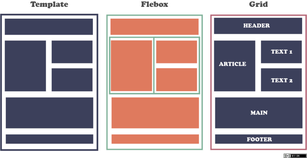
A powerful approach is to use Grid for the overall layout and Flexbox for components within grid items.
This is the core principle: nest Flexbox containers inside Grid items. Your page structure is managed by Grid, but the buttons in your header or the fields in your sidebar's contact form are aligned with Flexbox. This combination leverages the strengths of both systems.
Effortless Responsiveness
In the past, responsive design meant writing lots of media queries to change layouts at specific screen widths. While still useful, modern CSS gives us better tools for creating intrinsically responsive components.
With Grid, the auto-fill and auto-fit keywords are game-changers. When combined with minmax(), you can create a grid that automatically adjusts the number of columns to fit the available space. No media queries needed.
.card-container {
  display: grid;
  /* Create as many columns as will fit */
  /* Each column is at least 250px wide */
  /* Excess space is distributed equally */
  grid-template-columns: repeat(auto-fit, minmax(250px, 1fr));
  gap: 1rem;
}
In that example, auto-fit works similarly to auto-fill, but with a key difference. If your items don't fill the last row, auto-fit collapses the empty tracks to zero. The existing items then expand to take up the newly available space. This is often what you want for a gallery of cards that should always fill the container width.
Combining these techniques allows you to build complex, dashboard-style layouts that are robust and adapt beautifully. A sidebar can be a fixed-width grid column on desktop, but you can use grid-template-areas inside a media query to move it below the main content on mobile. Meanwhile, the items inside that sidebar can be aligned with Flexbox, ensuring they look great on any screen.
Ready to test your knowledge on modern layouts?
You are building a complex webpage layout that includes a header, a main content area, a sidebar, and a footer. Which CSS layout system is generally the best choice for defining these major structural regions of the page?
What is the primary function of the fr unit in CSS Grid?
By mastering both Grid and Flexbox, you gain full control over your web layouts, allowing you to build anything from simple blogs to complex web applications with clean, maintainable, and responsive CSS.