Full-Stack Developer Journey from Scratch
HTML and CSS
The Blueprint and the Paint
Every website you visit is built on two core technologies: HTML and CSS. Think of them like building a house. HTML, or HyperText Markup Language, is the blueprint and the frame. It creates the structure—the walls, the rooms, the doors, and the windows. CSS, or Cascading Style Sheets, is the paint, the furniture, and the decorations. It handles the visual presentation, making the house look good.
HTML is the backbone of the web, and mastering it is essential for any web developer.
Without HTML, there would be no content on a webpage. Without CSS, that content would be a plain, unstyled wall of text. Together, they create the visually engaging websites we use every day.
Structuring with HTML
HTML uses "elements" to structure a webpage. An element is usually made of an opening tag, content, and a closing tag. For example, to create a paragraph, you'd wrap your text in <p> and </p> tags. The <p> is the opening tag, and </p> is the closing tag.
Every HTML document has a basic structure that tells the browser how to read it. It includes a document type declaration, <!DOCTYPE html>, and the <html>, <head>, and <body> elements. The <head> contains meta-information, like the page title, while the <body> holds all the visible content.
<!DOCTYPE html>
<html>
<head>
  <title>My First Webpage</title>
</head>
<body>

  <h1>This is a Main Heading</h1>
  <p>This is a paragraph of text. HTML provides the structure.</p>

</body>
</html>
Here, <h1> defines a top-level heading, and <p> defines a paragraph. When a browser reads this code, it knows how to display each element correctly.

Styling with CSS
Once you have your HTML structure, CSS comes in to add style. CSS works by selecting HTML elements and applying rules to them. A rule consists of a property (like color or font-size) and a value.
Think of it this way: HTML is the what (the content), and CSS is the how (how it looks).
Let's take our previous HTML and make the heading blue and the paragraph text a bit larger. We can write CSS rules that target the <h1> and <p> elements.
/* This is a CSS comment */

h1 {
  color: blue;
}

p {
  font-size: 18px;
  line-height: 1.5;
}
You can include this CSS code in a separate file (the best practice), inside a <style> tag in the <head> of your HTML, or directly on an element. The browser then applies these styles to the corresponding HTML elements.
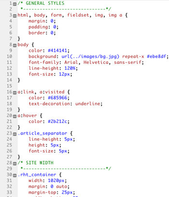
Beyond colors and fonts, CSS controls the entire layout of a page. Modern techniques like Flexbox and Grid give you powerful tools to arrange elements into complex, responsive columns and rows, ensuring your site looks great on any screen.
Making It Responsive
Today, people browse the web on phones, tablets, laptops, and giant desktop monitors. Responsive design is the practice of making your website look and work well on all of them. This isn't a luxury; it's a necessity.
The main tool for responsive design in CSS is the media query. A media query allows you to apply specific CSS rules only when certain conditions are met, such as the screen's width being below a certain size. For example, you might want a two-column layout on a desktop but a single-column layout on a phone to make it easier to read.
/* Default styles for all screens */
.container {
  width: 90%;
  margin: 0 auto;
}

/* Styles for screens 768px and wider */
@media (min-width: 768px) {
  .container {
    width: 80%;
    display: flex; /* A simple flex layout */
  }
}
This code tells the browser to use a flexible layout (display: flex) for the .container element, but only on screens that are 768 pixels wide or larger. On smaller screens, it will stack elements vertically by default, which is perfect for mobile viewing. By combining flexible layouts with media queries, you can create a single website that adapts beautifully to any device.
Time to check your understanding of these core concepts.
If building a website is like building a house, what do HTML and CSS represent?
In a standard HTML document, all the visible content like headings, paragraphs, and images is placed inside which element?
With HTML for structure and CSS for style, you have the foundation for building any website. The next step is often adding interactivity, which is where JavaScript comes in.