Foundations of Design Principles
Introduction to Design Principles
What Are Design Principles?
Design principles are the basic guidelines that help you arrange different visual elements. Think of them not as strict rules, but as a toolkit for creating things that are both effective and pleasing to look at. They help you decide where to put things, what to make bigger, and how to create a clear message.
When you understand these principles, you can communicate more clearly and create designs that guide the viewer’s attention exactly where you want it to go.
The Core Principles
Let's walk through the fundamental principles one by one. While each has its own role, you'll see that they often work together to create a cohesive whole.
Balance
noun
The distribution of the visual weight of objects, colours, texture, and space. A balanced design feels stable and natural.
Balance in design is just like balance in the physical world. If you place all the heavy elements on one side of a composition, it will feel lopsided and unstable.
There are two main types of balance:
- Symmetrical Balance: The elements on one side of the design are a mirror image of the other. It feels formal, orderly, and calm.
- Asymmetrical Balance: The sides are different, but still look balanced. A large element on one side might be balanced by several smaller elements on the other. This often feels more dynamic and modern.
Next up is contrast. Contrast is what you use when you want to make something stand out. It’s created when two elements are different from each other. This could be a difference in colour (like black on white), size (a huge headline next to small text), or shape (a circle next to a square).
Good contrast makes a design more engaging and helps with readability. It’s a key tool for creating emphasis and hierarchy.
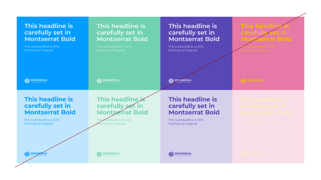
Hierarchy is about organising elements to show their order of importance. It tells the viewer what to look at first, second, third, and so on. A design with clear visual hierarchy is easy to scan and understand.
You can create hierarchy using size, colour, and placement. The most important element might be the largest, the boldest in colour, or placed at the top of the page.
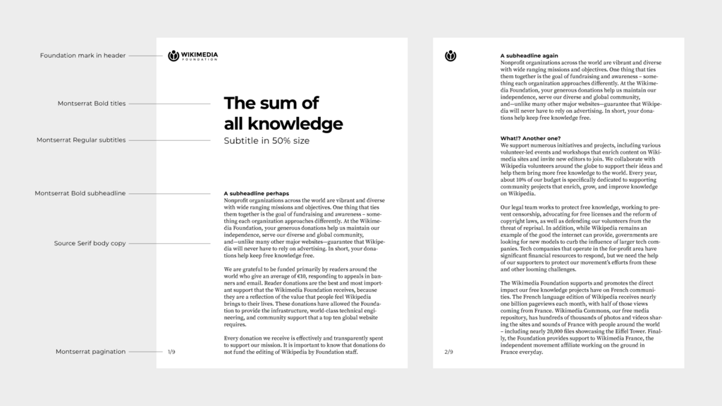
Repetition means reusing the same or similar elements throughout your design. This could be a consistent colour palette, the same font for all headings, or a recurring shape. Repetition ties individual elements together and creates a sense of unity and consistency. It makes a design feel familiar and cohesive.
Think about a brand's website, business cards, and social media posts. They all use the same logo, fonts, and colours. That's repetition in action, creating a strong, recognisable identity.
Proximity is about grouping related items together. When elements are placed close to one another, our brains perceive them as a single group. This simple principle helps to organise information, reduce clutter, and make layouts easier to understand.
For example, on a webpage, a picture and its caption are placed close together. This proximity tells you they are related.
Alignment creates a clean and orderly look by ensuring that nothing is placed on the page arbitrarily. Every element should have a visual connection to another. You can align elements to the left, right, centre, or justify them.
Even when elements are far apart, if they are aligned, they feel connected. Proper alignment is one of the most important factors in creating a professional-looking design.
Finally, there's white space, also known as negative space. It's the empty area around and between the elements of a design. It's not just 'blank' space, it's an important design element in its own right.
White space gives your design room to breathe. It can separate different groups of information, create focus on a particular element, and improve legibility. A design without enough white space can feel crowded, confusing, and cheap.
Don't be afraid of empty space. Often, what you don't include is just as important as what you do.
Putting It All Together
These principles don't work in isolation. A good design uses several of them in harmony.
For instance, you might use contrast and size to establish hierarchy. You use proximity to group related items, and alignment to connect them visually. Repetition of colours and fonts creates unity, while white space ensures the whole layout feels balanced and readable.
Learning to see and use these principles is the first step toward creating effective and compelling visual communication.
Which design principle is primarily concerned with guiding the viewer's eye through the content in order of importance?
You are designing a poster and place all the event details—date, time, and location—close together in the bottom right corner. Which principle are you primarily using to show these items are related?