Foundations of Design for Media
Design Principles
The Building Blocks of Design
Good design isn't just about making things look pretty. It's about clear communication. Whether you're creating a webpage, a poster, or a presentation, you're guiding your audience's eyes and helping them understand a message. To do this effectively, designers rely on a set of fundamental principles. Think of them not as strict rules, but as reliable guidelines that help bring order and clarity to visual information.
Design isn’t just about making things look good; it’s about creating visual harmony and effectively communicating your message.
By understanding these core ideas, you can start to see why some designs feel right and others feel chaotic or confusing. Let's walk through five of the most important principles: balance, proportion, emphasis, rhythm, and unity.
Finding Balance
Every element on a page has a certain visual weight. This weight is influenced by its size, darkness, and thickness. Balance is the principle of distributing this visual weight so that the overall design feels stable and comfortable, not lopsided.
Imagine a seesaw. To keep it level, you need to balance the weight on both sides. The same concept applies to a visual composition.
There are two main types of balance:
- Symmetrical Balance: This occurs when elements are mirrored on either side of a central axis. It creates a sense of formality, order, and stability. Think of the human face or the front of a classical building.
- Asymmetrical Balance: This is achieved by using different elements with equal visual weight on each side of the axis. A large, light-colored shape on one side might be balanced by a small, dark shape on the other. This type of balance is often more dynamic, modern, and interesting.
Getting Proportions Right
Proportion is all about the size relationship between different elements in a design. How big is the headline compared to the body text? How large is the photo in relation to the entire page? When the proportions are correct, the design feels harmonious and natural.
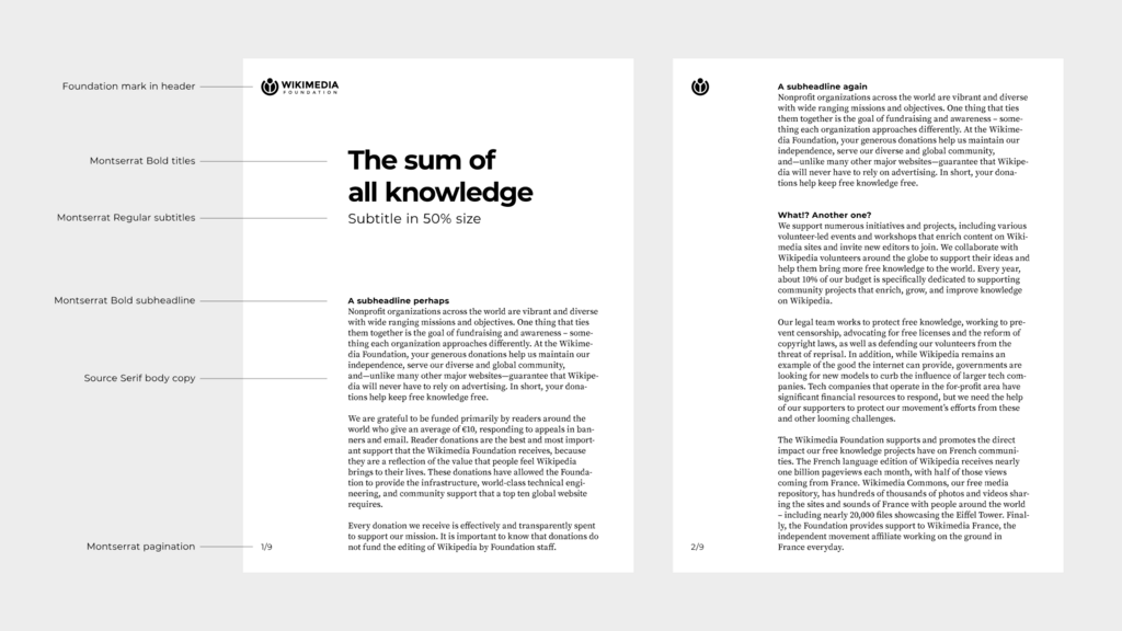
Getting proportion right helps establish a clear visual hierarchy. A large, bold headline instantly signals that it's the most important piece of information. Subheadings are smaller, and body text is smaller still. This guides the viewer's eye through the content in the intended order. When proportions are off, it can be disorienting and make the design hard to read.
Creating a Focal Point
While balance creates stability, emphasis is about creating a center of interest—a focal point that draws the viewer's eye first. Without a clear point of emphasis, a design can feel boring and the viewer won't know where to look. You can create emphasis using contrast in size, shape, or placement.
Emphasis
noun
The principle of making one element stand out to draw the viewer's attention and establish a focal point.
Think of a poster for a concert. The band's name is usually the largest element, creating a clear focal point. The date and venue are important but secondary, so they are smaller. Everything on the page can't be equally important. Deciding what to emphasize is a key part of effective communication.
The Pulse of the Design
Rhythm in design is similar to rhythm in music. It’s the visual pulse that guides the eye through the composition. Rhythm is created by repeating elements like lines, shapes, or textures in a predictable pattern. This repetition creates a sense of movement and flow.

A simple example is a row of columns on a building or a pattern on a piece of fabric. The repetition isn't just for decoration; it leads the eye along a path. A good rhythm makes a design feel organized and alive, preventing it from feeling static or random.
Tying It All Together
Unity is the ultimate goal of any design. It’s the feeling that all the individual parts—the balanced shapes, the proportional text, the emphasized focal point, the rhythmic patterns—belong together and are working in harmony. A unified design feels cohesive and complete.
If a design has unity, it doesn’t feel cluttered or chaotic. Every element has a clear purpose and relationship to the others on the page.
Achieving unity means looking at the composition as a whole. Do the different sections feel connected? Is there a consistent style? By applying the principles of balance, proportion, emphasis, and rhythm, you create the conditions for a unified and powerful design that effectively communicates its message.
Ready to test your knowledge?
A webpage layout where a large, light-colored image on the left is offset by a small block of dark, bold text on the right is an example of what?
What is the primary function of proportion in establishing a visual hierarchy?
Mastering these principles provides a solid foundation for making thoughtful and effective design choices.