Figma Mastery in Brand and Digital Design
Typography Fundamentals
The Building Blocks of Type
Typography is the art of arranging letters and text in a way that is legible, readable, and appealing. It’s not just about choosing a font; it’s about how that font is used. Every choice, from the size to the spacing, shapes how we perceive a message.
Think of fonts as the clothes your words wear. Some are formal, like a tuxedo. Others are casual, like jeans and a t-shirt. The right choice makes the message clear and effective. The wrong one can be confusing or send an unintended signal. Understanding the basic parts of a letter helps us see how these different outfits are put together.
Every letter has a unique structure. Here are a few key terms:
- Baseline: The invisible line upon which a line of text rests.
- X-height: The height of the main body of a lowercase letter, like 'x'.
- Ascender: The part of a lowercase letter that extends above the x-height, like in 'h' or 'b'.
- Descender: The part of a lowercase letter that extends below the baseline, like in 'p' or 'g'.
These small details define a typeface’s character and affect how readable it is.
Families of Fonts
Typefaces are often grouped into a few main categories. Understanding these helps you choose the right one for the job.
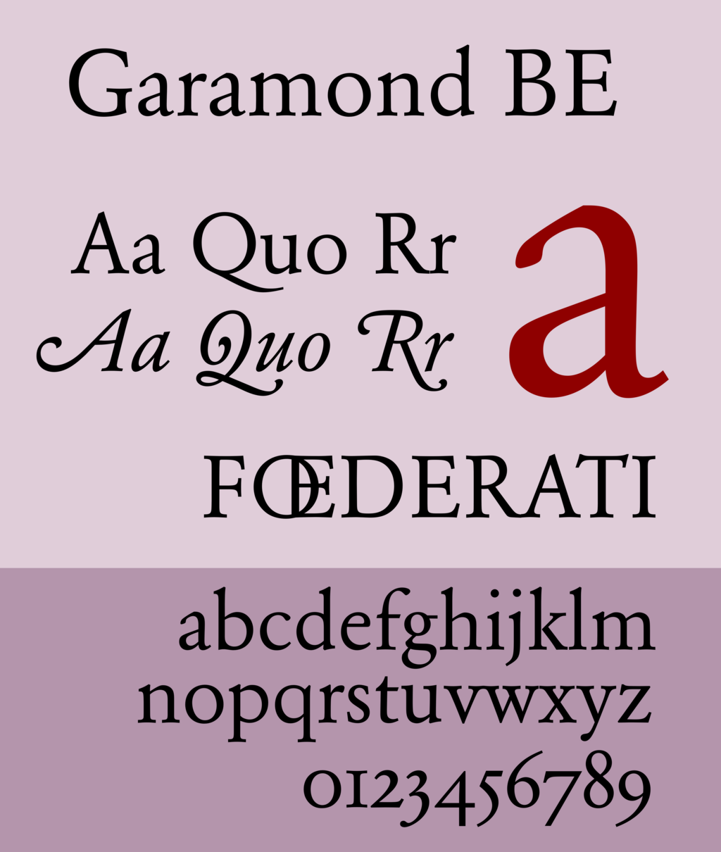
Serif: These fonts have small lines or strokes (called serifs) attached to the end of larger strokes in letters. They originated from ancient Roman carvings. Serif fonts often feel traditional, formal, and trustworthy. They are very common in books and newspapers because the serifs help guide the eye along the lines of text, making them easy to read in long passages.
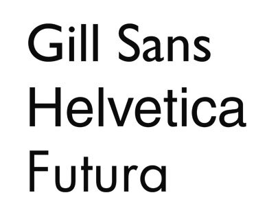
Sans-serif: "Sans" is French for "without." As the name suggests, these fonts lack serifs. This gives them a clean, modern, and minimalist feel. They are popular for headlines, digital screens, and branding where clarity and simplicity are key. Fonts like Helvetica and Arial are classic examples.
What about script and display fonts? Script fonts mimic handwriting, ranging from elegant cursive to casual scrawls. Display fonts are the wild cards—they're bold, decorative, and full of personality. Both are best used for short text, like logos or headlines, where you want to make a strong visual impact.
| Typeface | Key Feature | Common Feeling | Best Use |
|---|---|---|---|
| Serif | Small strokes at the end of letters | Traditional, Reliable | Long-form text, books |
| Sans-serif | No strokes at the end of letters | Modern, Clean, Simple | Headlines, web, mobile apps |
| Script | Cursive or handwriting style | Elegant, Personal | Invitations, logos, headings |
| Display | Decorative, unique | Expressive, Stylized | Posters, titles, branding |
Fonts Have Feelings
Beyond just looking different, fonts have the power to evoke emotions and shape perceptions. This is the psychology of typography. The shapes of the letters, the thickness of the strokes, and the spacing all contribute to the overall tone of a message.
A heavy, blocky font might feel strong and assertive, while a thin, light font can feel delicate and elegant. A rounded, soft font seems friendly and approachable, whereas a sharp, angular one can appear more serious or edgy.
When you're designing something, think about the message you want to send. Are you building a brand that needs to feel trustworthy and established? A classic serif might be a good choice. Are you launching a tech startup that wants to look sleek and innovative? A clean sans-serif would probably work better.
Choosing a font is about more than just aesthetics; it's about communication. The right typeface reinforces your message, while the wrong one can undermine it.