Figma Design Systems
Introduction to Design Systems
What Is a Design System?
Think of a design system as the ultimate instruction manual for a product's look and feel. It’s a complete set of standards, reusable components, and guidelines that allows teams to design and build products efficiently and consistently. It's not just a style guide that lists colors and fonts; it's a living library of everything from a brand's philosophy down to the code for a specific button.
Imagine building with LEGO bricks. Instead of making each brick from scratch every time you want to build something, you have a pre-made set of standard bricks that all fit together perfectly. A design system provides those 'bricks' for digital products. This shared toolkit ensures that no matter who is building a new feature or page, the result will look and feel like it’s part of the same family.
A design system is a collection of reusable components, guided by clear standards, that can be assembled to build any number of applications.
Why Bother with a System?
Implementing a design system might seem like extra work up front, but it pays off significantly. The primary goal is to solve the problems of inconsistency and inefficiency that often plague growing teams and products.
Without a system, a simple button might be designed and coded differently across ten different pages of a website. This creates a disjointed user experience and wastes valuable time for designers and developers who are constantly reinventing the wheel. A design system eliminates this redundancy.
The result? Teams can focus on solving complex user problems instead of sweating the small stuff, like how rounded a button's corners should be.
Key benefits include:
- Consistency: Every part of your product feels cohesive, which builds user trust and makes the interface more predictable and easier to use.
- Efficiency: Teams can build and ship new features faster because they're using pre-built, pre-approved components.
- Collaboration: It creates a single source of truth and a shared language for designers, developers, product managers, and everyone else involved. This reduces friction and misunderstandings.
- Scalability: As a product grows, a design system makes it much easier to maintain quality and consistency across new features and platforms.
The Core Components
A design system isn't just one thing; it's a collection of parts that work together. While they can vary between organizations, most robust design systems include a few key elements.
| Component | Description |
|---|---|
| Design Principles | The foundational goals and philosophy. What makes the product's design unique? What values should it reflect? |
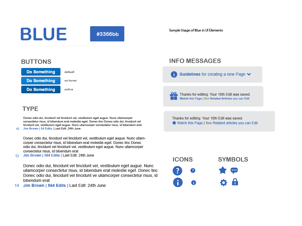
| Style Guide | The visual identity. This includes the color palette, typography scales, spacing rules, and icon library. |
| Component Library | A collection of reusable UI elements like buttons, forms, navigation bars, and cards. Each component has defined states and usage guidelines. |
| Documentation | The instruction manual. It explains how to use the system, with clear guidelines, best practices, and code examples. |
A well-thought-out design system acts as a bridge between designers and developers, creating a shared language that eliminates confusion.
These components come together to create a powerful, scalable framework. It ensures every user touchpoint is consistent, intentional, and high-quality.