Figma Auto Layout and Constraints Mastery
Introduction to Auto Layout
Designing with Flexibility
Imagine building a button. You create a rectangle, add some text, and center it perfectly. Then, the text changes from “Submit” to “Sign Up for Free.” Suddenly, you have to resize the rectangle, re-center the text, and adjust everything around it. It's a small hassle, but it adds up across a whole design. This is where Auto Layout comes in.
Auto Layout is a feature in Figma that lets you create frames that automatically grow or shrink as you change the content inside them. Instead of manually pushing pixels, you create dynamic, responsive components. Think of it like a smart container that handles the spacing and alignment for you.
Turn on auto layout for responsive designIf you're tired of manually resizing elements when tweaking your design, Auto Layout is your best friend.
Putting Auto Layout to Work
Applying Auto Layout is simple. Just select a frame or a group of objects and click the “+” button next to “Auto layout” in the right sidebar, or use the shortcut Shift + A. Once applied, your frame becomes an Auto Layout frame, and a new set of properties appears.
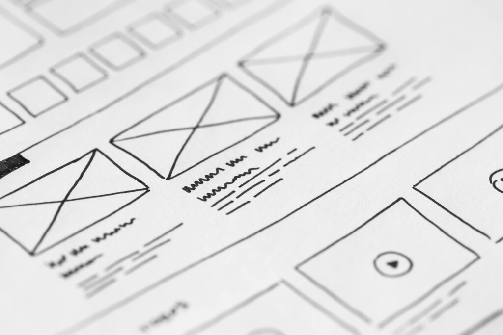
These properties are the controls for your smart container. Let's break down the most important ones.
Direction
noun
This property controls the flow of the items inside the frame. You can arrange them vertically (top to bottom) or horizontally (left to right).
Next is the spacing between items. This single number defines the gap between every element in the frame, ensuring consistent spacing without any manual measurement. Change it, and all the gaps update instantly.
A horizontal row of navigation links would use a horizontal direction, while a vertical list of comments would use a vertical direction.
Finally, there’s padding. Padding is the empty space around the inside of the Auto Layout frame, acting as a buffer between the frame's border and its contents. You can set uniform padding for all sides or adjust the top, bottom, left, and right values independently.
Perfecting Alignment
Once you have your direction, spacing, and padding set, the final step is alignment. Alignment controls where the items sit within the Auto Layout frame, both along the frame's axis and perpendicular to it. For a vertical list, you can align items to the left, center, or right. For a horizontal row, you can align them to the top, center, or bottom.
This is especially useful when items have different sizes. You can ensure that a small icon and a tall block of text are perfectly centered next to each other, or that a series of buttons are all aligned to the top of their container.
By mastering these basic properties—direction, spacing, padding, and alignment—you can start building robust, flexible components. Your designs will be more consistent and far easier to update, saving you time and effort.