Exploring the Letters K and W Visually
Letter K Visuals
The Structure of K
At its core, the uppercase letter 'K' is a simple construction of three straight lines. It begins with a vertical line, known as a stem. From the midpoint of this stem, two diagonal lines extend outwards. The one pointing up is called an arm, and the one pointing down is the leg.
This basic structure is like a skeleton. Designers and typographers can change the length, thickness, and angle of these three parts to create countless variations. The lowercase 'k' often keeps the tall stem but shortens the arm and leg, connecting them lower down.
K in Typography
In typography, the letter 'K' takes on many personalities. In a serif font, it might have small decorative strokes at the ends of its lines. In a sans-serif font, it will have clean, unadorned edges. Script fonts might connect the 'K' to other letters with elegant, flowing strokes.
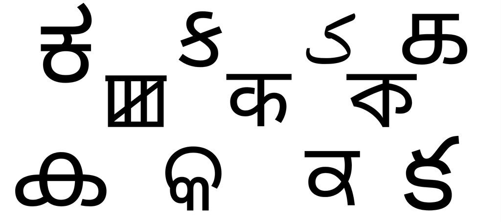
The negative space created by the arm and leg of a 'K' is a key consideration in design. This open area affects how the letter fits with its neighbors. Typographers adjust the spacing around a 'K' through a process called kerning to ensure it looks balanced and readable next to letters like 'A' or 'O'.
K in Media and Signs
How we see the letter 'K' often depends on where we see it. In print, like books and magazines, clarity is paramount. The 'K' is usually designed to be easily readable, with balanced proportions that work well in a block of text.
Digital media presents a different challenge. A 'K' used in a logo on a website or an app icon must be recognizable even at very small sizes on a phone screen. This often leads to bolder, simpler, and more stylized versions of the letter.
In signage, from storefronts to road signs, the letter 'K' needs to be legible from a distance and at a glance. Sign designers often use thick strokes and wide-open forms to make the letter stand out. The context dictates the design, but the fundamental structure of a stem, arm, and leg always remains.
What are the three fundamental parts of the uppercase letter 'K'?
The process of adjusting the spacing specifically between a 'K' and an adjacent letter like 'A' to ensure it looks visually balanced is called:
Understanding the visual life of a single letter helps us appreciate the careful design behind the words we read every day.