Excel Conditional Formatting Mastery
Introduction to Conditional Formatting
Make Your Data Speak
Spreadsheets are great for organizing information, but a wall of numbers can be hard to interpret. Conditional formatting is an Excel feature that automatically changes how cells look based on the data inside them. Think of it as setting up rules that tell your spreadsheet: "If a number is high, make it green. If it's low, make it red."
This simple trick makes your data much easier to understand at a glance. Instead of scanning endless rows and columns, your eyes are immediately drawn to the most important information. It helps you spot trends, identify outliers, and highlight problem areas without any manual work.
The main purpose of conditional formatting is to make data visual, turning raw numbers into an insightful story.
To get started, you'll find everything you need on the Home tab in the Excel ribbon. Look for the Styles group, and you'll see the Conditional Formatting button. Clicking this opens a dropdown menu filled with different formatting options.
Types of Formatting Rules
Excel offers several preset rule types that cover most common needs. These are your starting toolkit for bringing data to life.
Highlight Cells Rules
other
These rules format cells that meet a specific condition, like being greater than, less than, or equal to a certain value. You can also highlight cells containing specific text or dates.
Next are Top/Bottom Rules. These are perfect for quickly finding the best and worst performers. You can highlight the top 10 items, the bottom 5%, or values that are above or below the average for the entire range.
For example, you could instantly find your top 10 best-selling products in a list of thousands.
Some options go beyond just changing a cell's color. They add graphics directly into the cells to represent their values.
| Rule Type | Description |
|---|---|
| Data Bars | Fills each cell with a horizontal bar. The longer the bar, the higher the value, creating a simple in-cell bar chart. |
| Color Scales | Applies a color gradient to a range of cells. For instance, the lowest values might be red, fading to yellow for mid-range values, and green for the highest ones. |
| Icon Sets | Adds a small icon to each cell based on its value. Common sets include traffic lights (red, yellow, green), arrows (up, down, sideways), or star ratings. |
These tools let you transform a static grid of numbers into a dynamic dashboard that tells a story. Even a simple color change can make a huge difference in how quickly you and others can draw conclusions from your data.
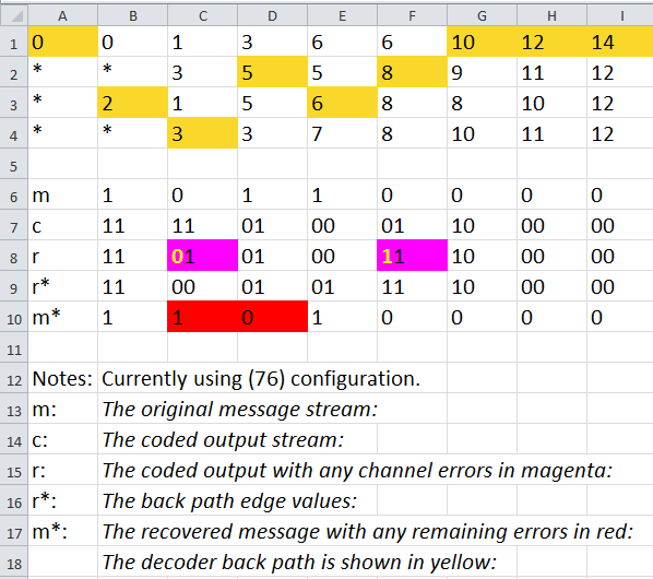
Visual formatting plays a pivotal role in reducing interpretation time and guiding readers through layered evaluations.
Ready to test your knowledge? Let's see what you've learned about the fundamentals of conditional formatting.
What is the primary purpose of using conditional formatting in a spreadsheet?
On which tab in the Excel ribbon would you find the Conditional Formatting button?
Mastering these basic rules is the first step toward creating clearer, more effective spreadsheets. They provide a powerful way to analyze data without complex formulas or functions.